
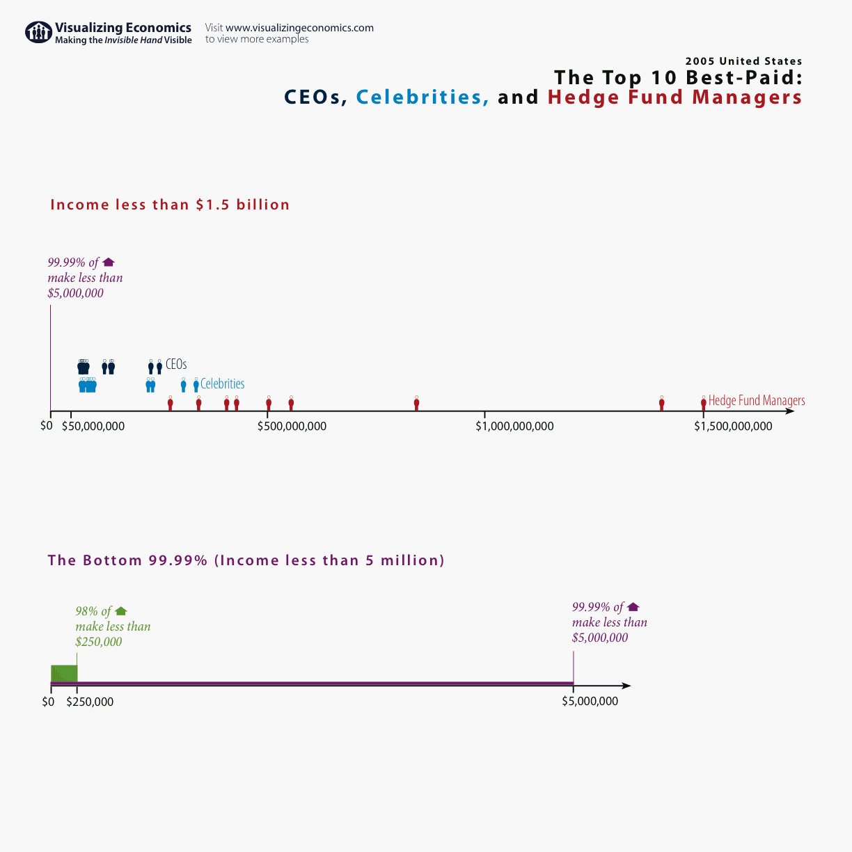
I went back to my 2005 US Income Distribution graph but this time I looked at the income of everyone above $250,000. Although one can find lists of high income earners it is very difficult to find a graph plotting their earnings as compared to everyone else. The scale of the graph is so extreme that most of the population ends up looking like a dot at the bottom of the graph. Below I have created 3 graphs that try to show the relationship between the bottom 99.99% and the top 0.01%.


The original Census data can be found at Table HINC-06. Income Distribution to $250,000 or More for Households
The bottom 99.99% I estimated from data found at Emmanuel Saez's web site
The CEO and Celebrity income estimates came from Forbes magazine
And finally the income for the top hedge fund managers was first published at Alpha magazine but I found it via the New York Times