
From around the web


"This is no dull, I’m-reading-the-World-Almanac sort of tome. Mulbrandon’s visualizations are bold and interesting, simple without being simplistic, and multi-axial in a way that makes a USA Today infographic look like a kids’ coloring book by comparison." – Dave Maney, Founder, Economaney Digital
"Mulbrandon is a phenomenally talented graphic artist who combines artistic flair with a deep knowledge of economics." –Timothy Noah, author of The Great Divergence
"...this book is a milestone to show others how to tackle questions in other fields - using data, statistics and visualization." –Mirko Lorenz, Journalist / Information Architect
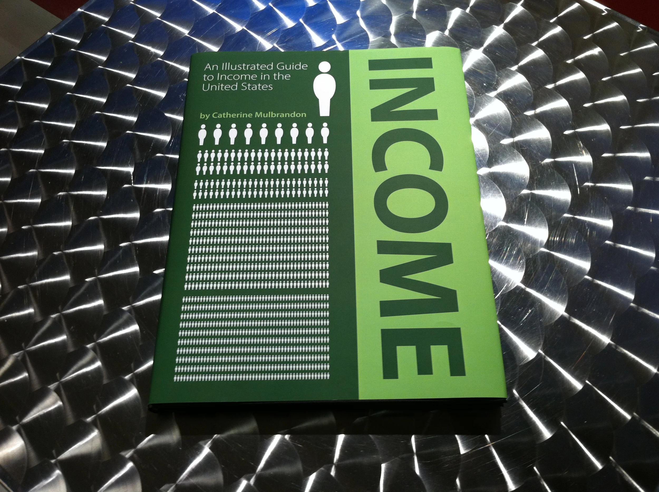
About the book

In 2011, I launched a project on Kickstarter.com to raise money for a collection of infographics that tells the story of income in the United States. You can see the entire project proposal on my Kickstarter project page. I also received a NMWE grant from the J-lab at American University funded by the McCormick Foundation. You can see my updates on their website.
My goal was to place this data in historical and geographical context, including explanations for terms like CPI and GDP for those readers who don't have a background in economics. The data comes from the US Census, IRS, Congressional Budget Office, Bureau of Labor Statistics, Bureau of Economic Analysis plus academic articles and other research on the subject. I posted a more complete list of of data sources I used in the book.
Some of the questions I cover in the book…
Who are the top earners in the country (and what is their income)?
What’s the impact of stock options on income?
What are the demographics of different income earners?
Which industries have the greatest job growth?
How has income distribution changed over the last decades?
Which counties have the highest income levels? Which have the highest poverty rates?
How have standards of living changed over the last 100 years? Over the last 40 years?
How do the incomes of celebrities, CEOs and Hedge Fund Managers compare?
Read my blog to find out more about what I learned about income and the techniques and strategies I used to make the book.
The Making of An Illustrated Guide to Income
Software Tools
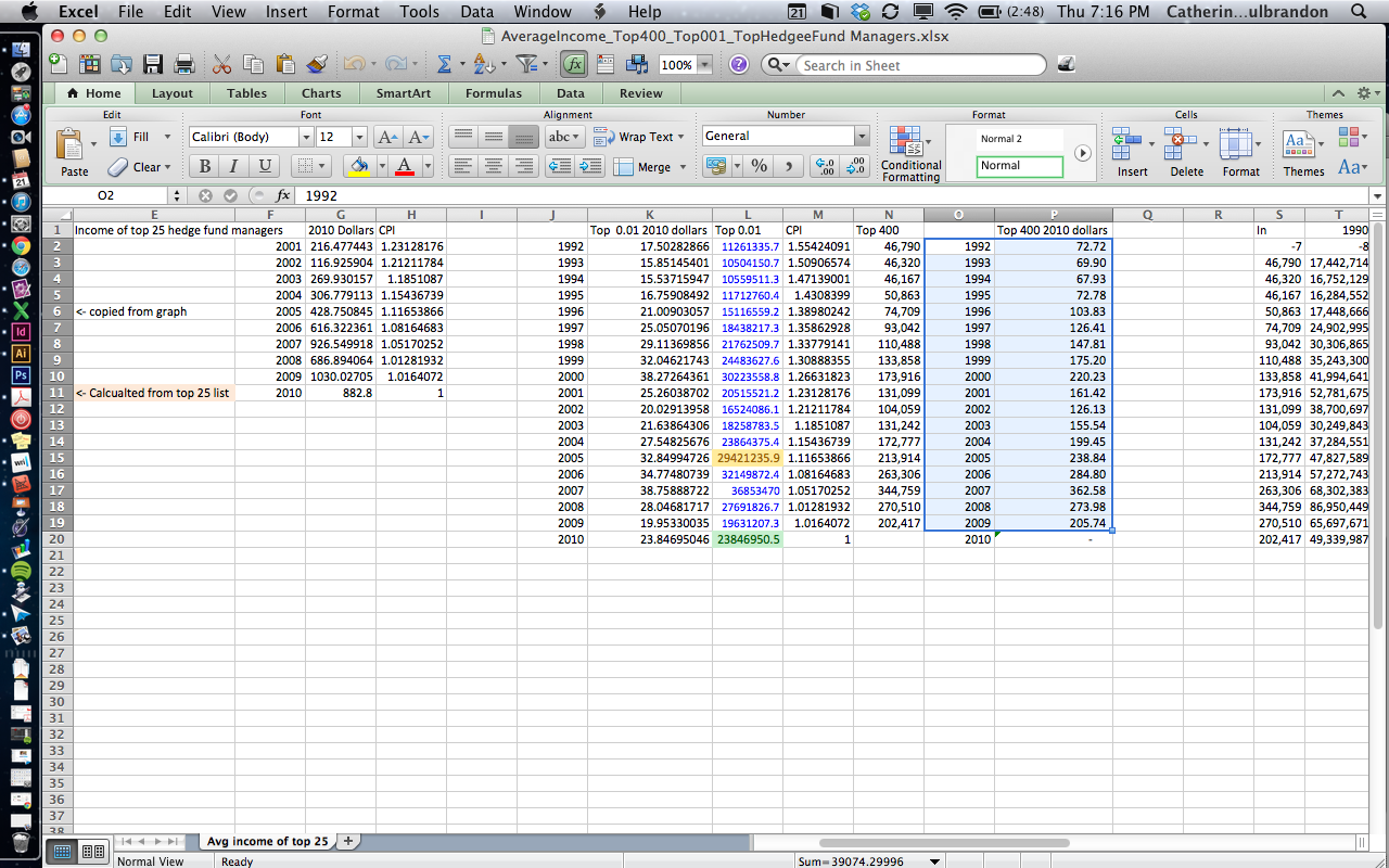
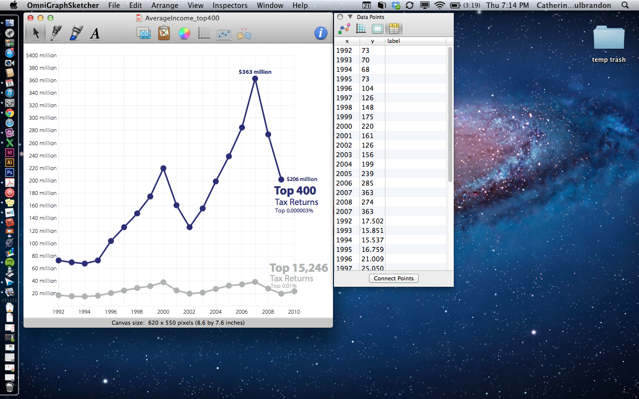
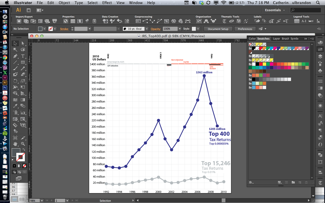
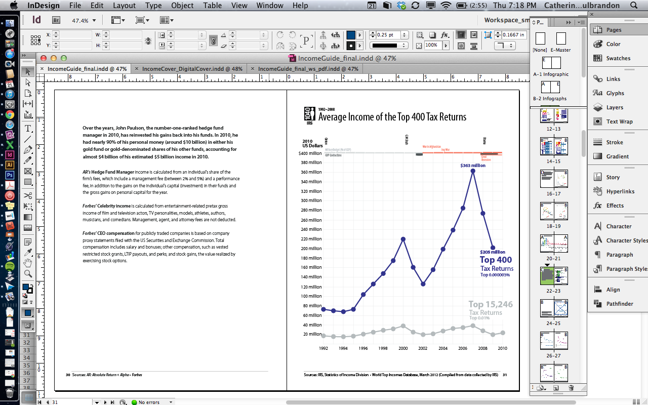
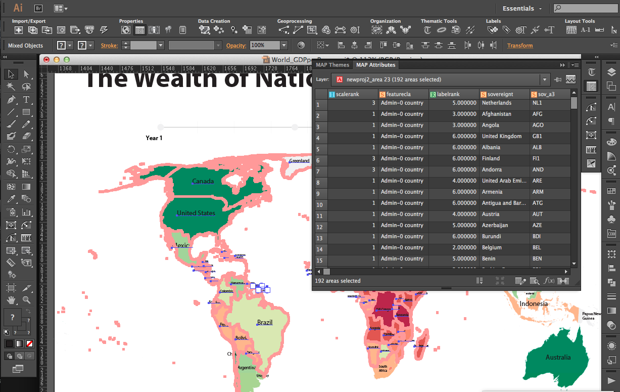
The bulk of the work was completed through the use of five major software tools: Excel, OmniGraphSketcher, Illustrator, R, and finally InDesign to compile the graphics together into the final book.

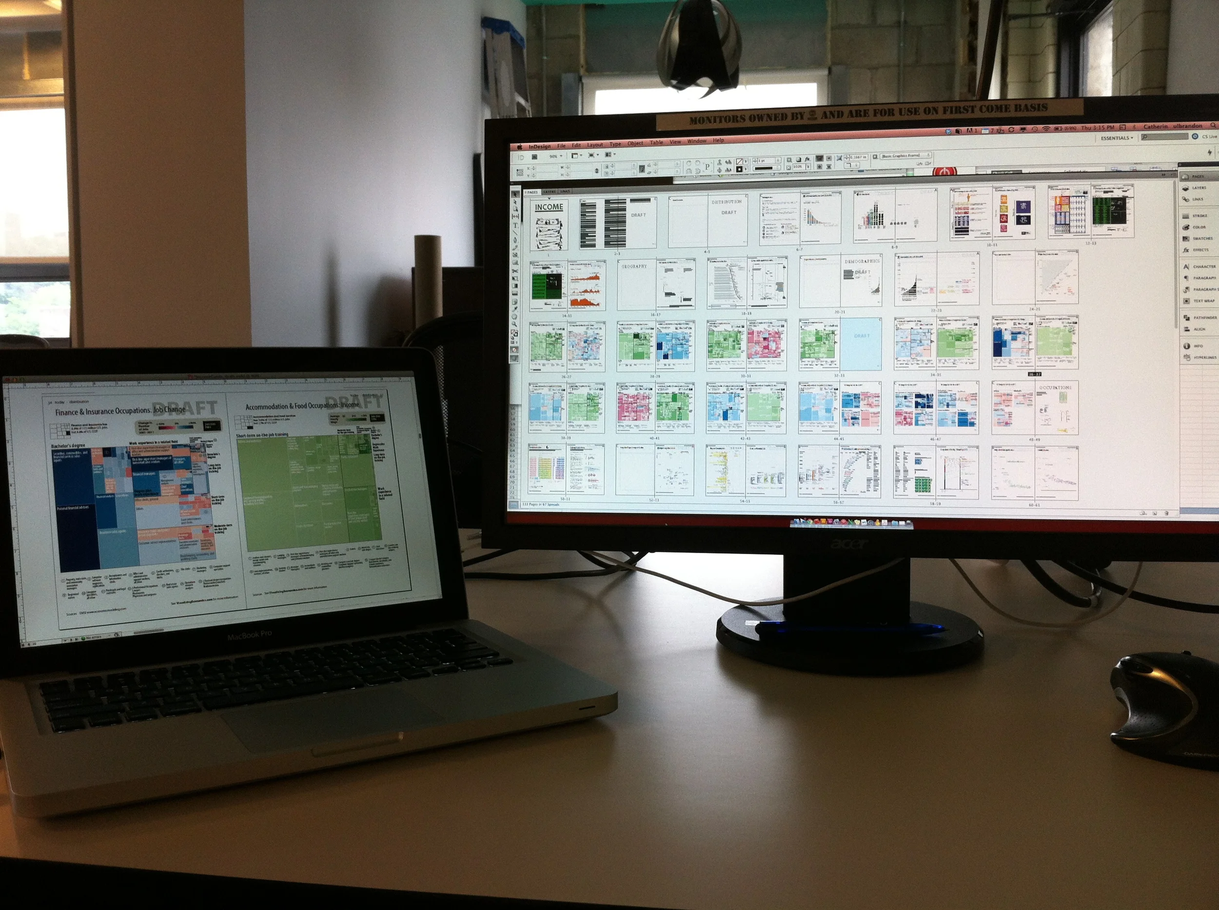
Workspace
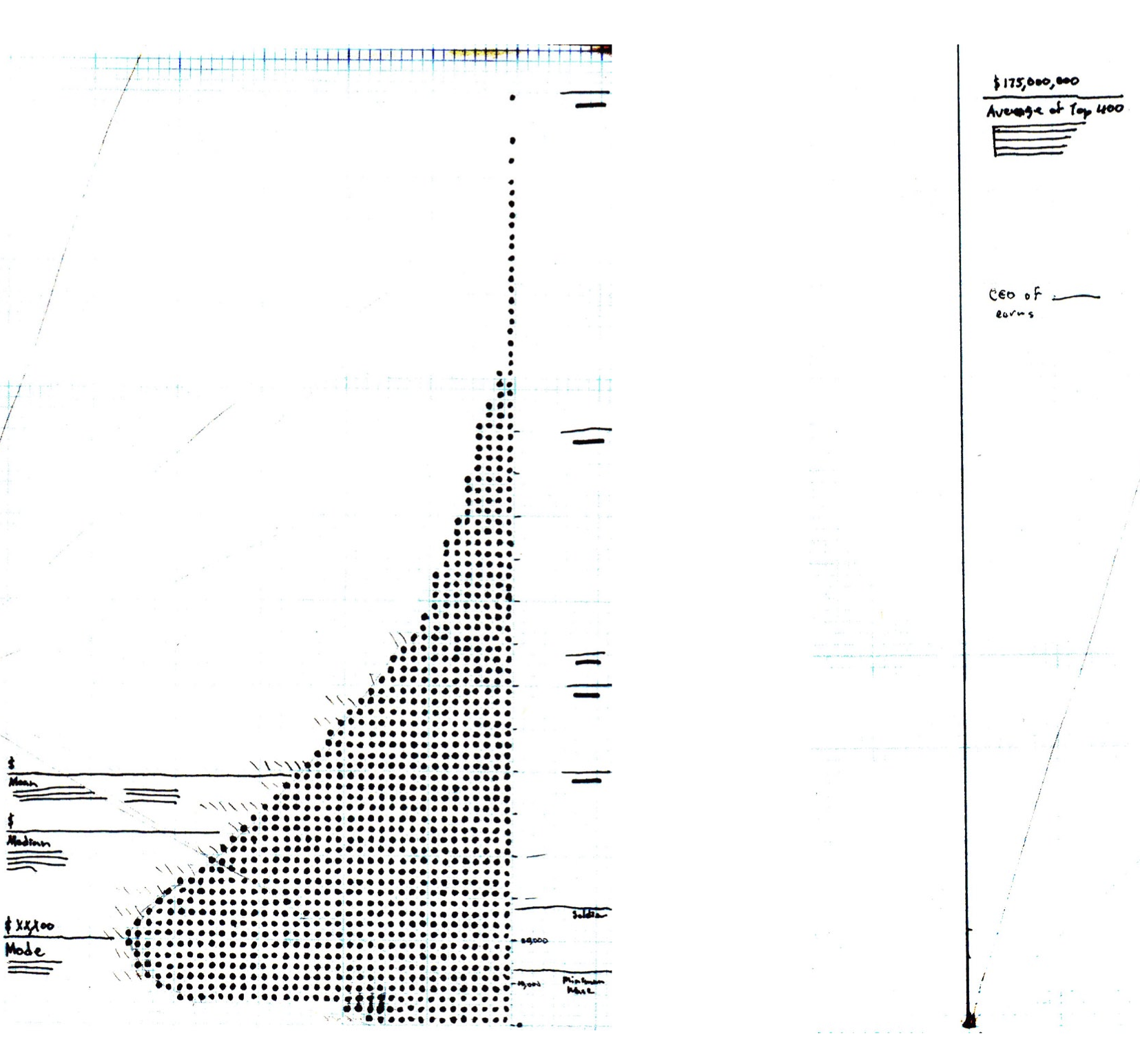
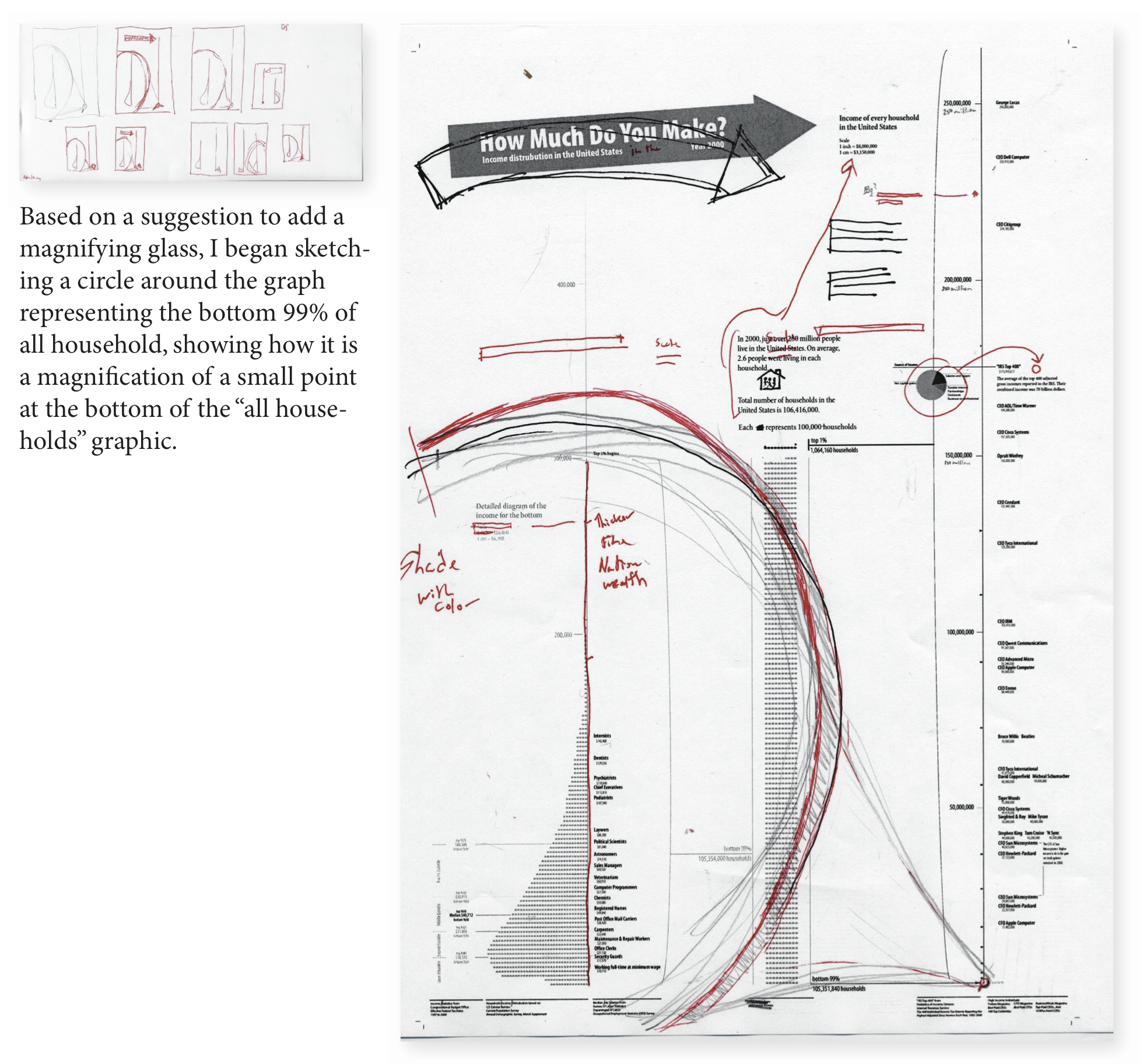
While most of the work was on my MacBook Pro, I found myself returning to paper for early sketches...
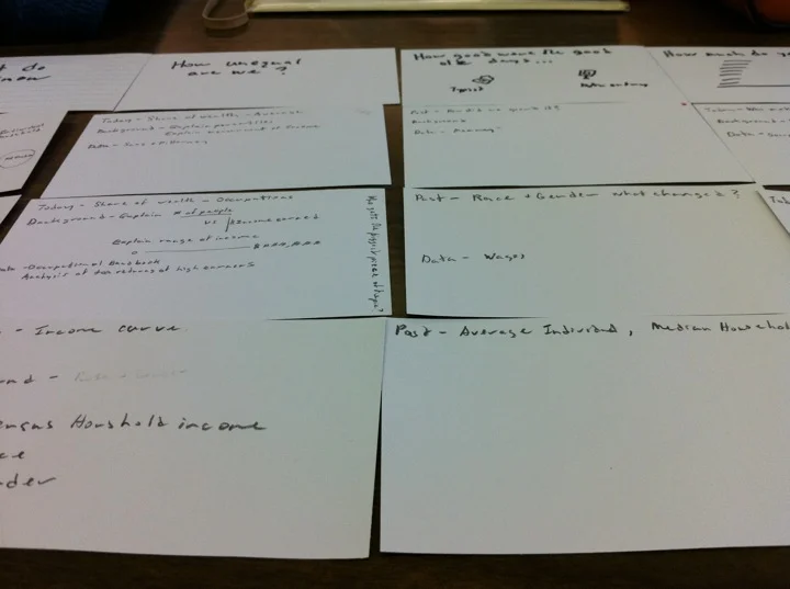
Early Table of Contents
...making hypothetical table of contents as I work on individual graphics to look for holes in the book...

Laying out the pages
...laying out miniature view of all the pages so I can compare the charts and graphs looking for the ways to make the design more consistant...
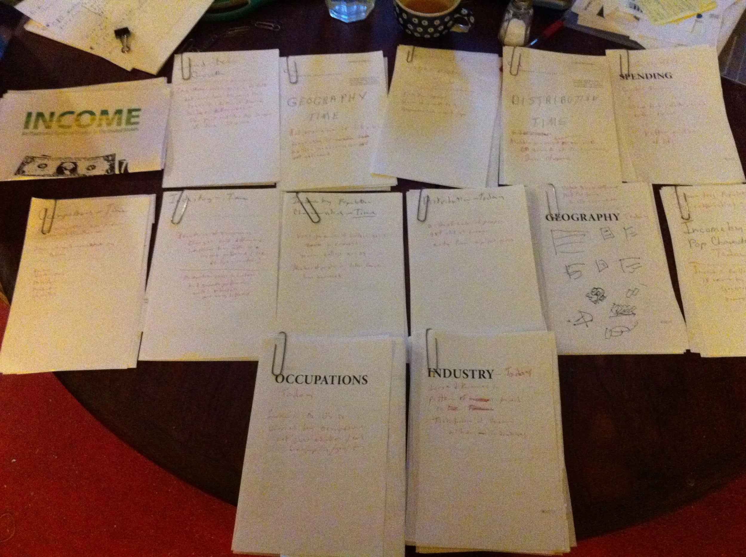
Building Chapters
...then grouping these pages together in stacks as I looked for themes for individual chapters.

Fuel
About the Author
Catherine Mulbrandon earned a bachelor’s degree in economics from the University of Chicago, a master’s degree in design from Carnegie Mellon University and has worked in the finance industry for 10 years. In 2006, she launched VisualizingEconomics.com, a website dedicated to publishing infographics about economic data and promoting data visualization. A native of Washington, D.C., Mulbrandon currently lives in Jersey City, NJ.