

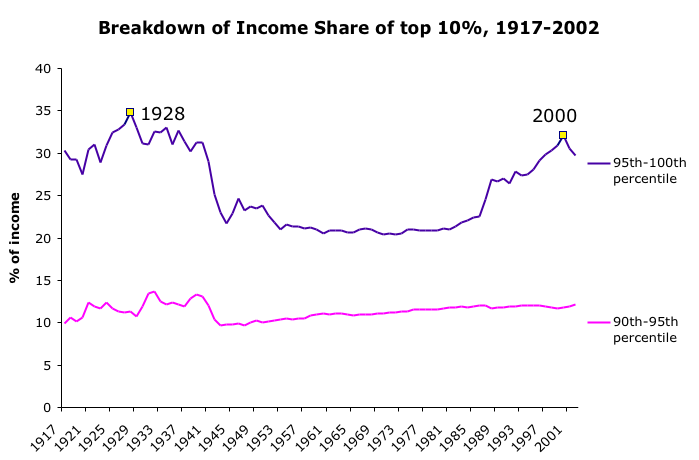
Here, I am taking a closer look at the bottom and top halves of the Top 10%. Look at the dramatic change in income share going to the top 5% (purple line), from 35% to 20% to 32%. Again it is the most wealthy who have the extreme changes in income. (See previous graphs that I posted about the drop in income after 2000)
Also the share of income going to the top 5% in 2000 was closing in on the previous high in 1928. Then they lost ground with the stock market decline.