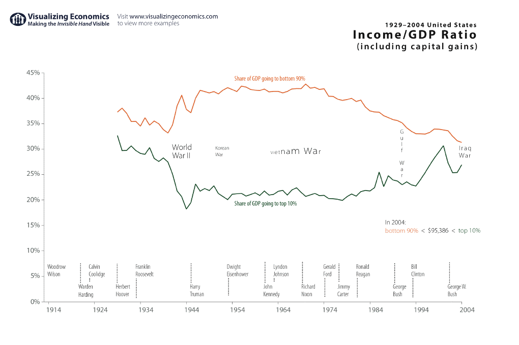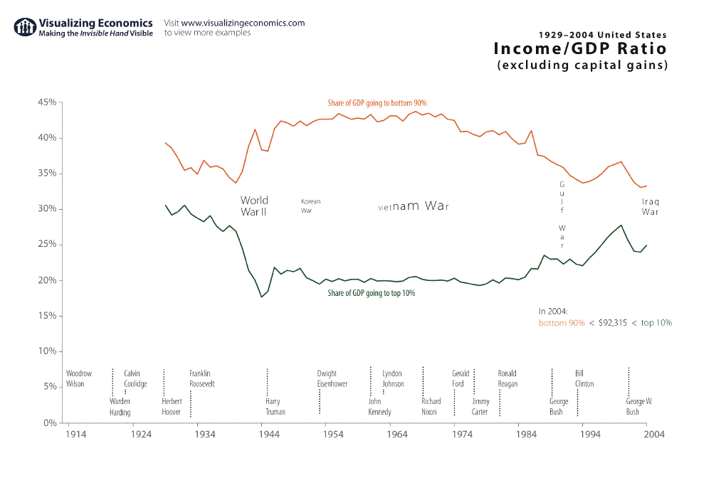

I created these graphs show the change in the share of GDP going to the top 10% as compared to the bottom 90% since 1929. I have two versions: one with capital gains and one without. {Click on each graph to take a closer look}

You can see the sudden drop in the share going to the top 10% (the effect of WWII). Later the slow decline in the share going to the bottom 90% during the 70s, 80s, and 90s.
In 2004 you had to make around $95,000 to make the top 10%.
Data from the IRS found on Emmanuel Saez's web site

