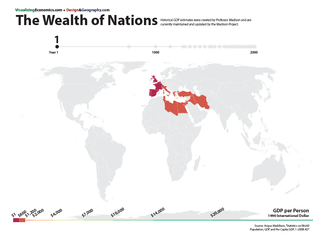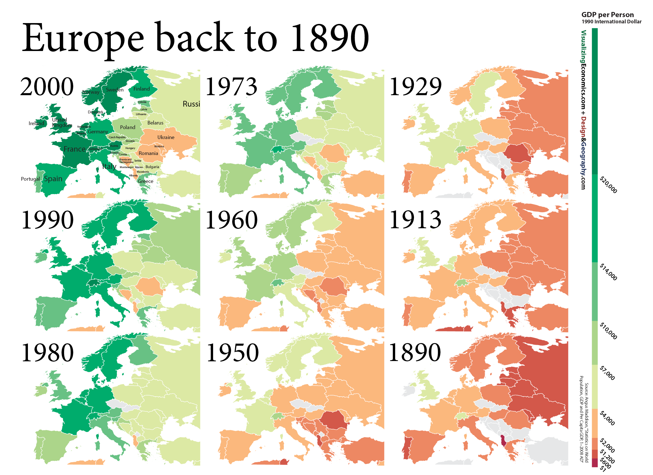
From a series of maps I created (with the help of my urban geographer brother) it is the growth of Europe across 110 years with nine maps. Data is adjusted for inflation.
Data from Maddison Project

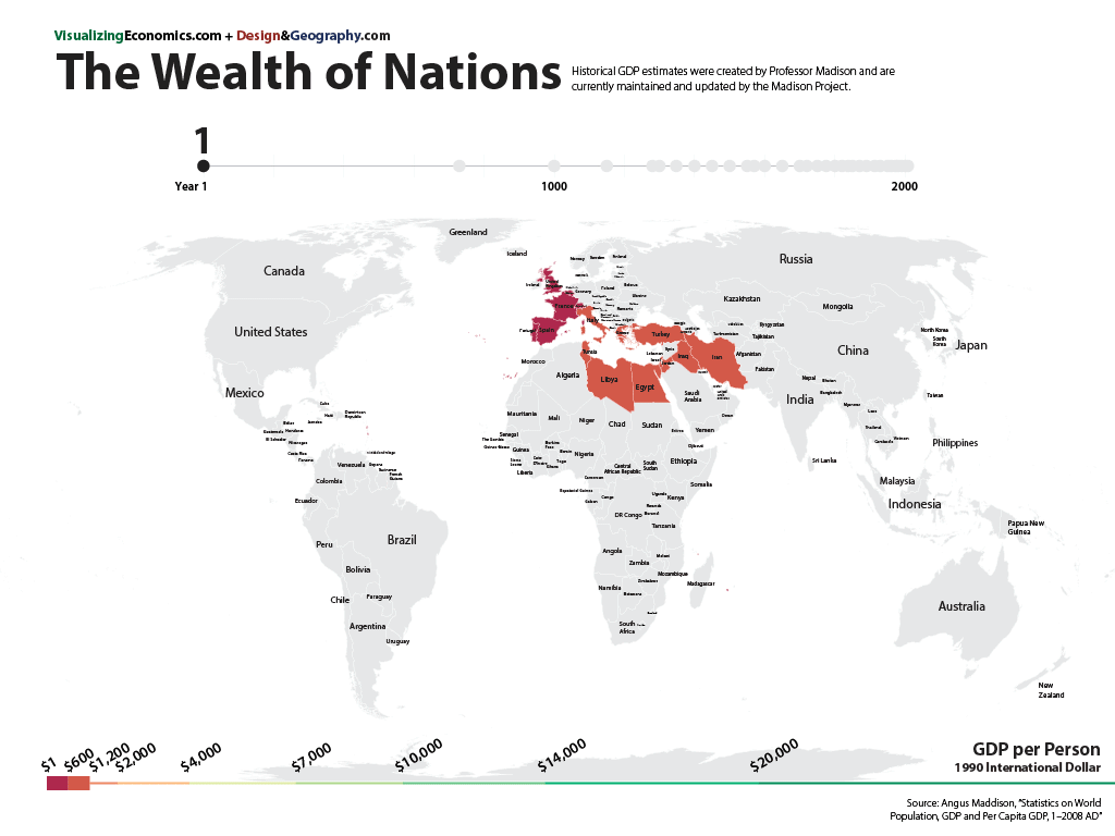
From a series of maps I created (with the help of my urban geographer brother) it is the growth of Europe across 110 years with nine maps. Data is adjusted for inflation.
Data from Maddison Project
A simple map of Average Household Income by county
Made with Python, GEO Pandas -> formatted in Illustrator with MAPublisher plugin. Data from US Census Bureau, 2006–2010 American Community Survey.
A set of housing maps which I create with Matthew Mulbrandon of DesignandGeography.com. There you can find a series of posts about the housing market including:
One of the most popular maps I have on my site I got from a site called Social Explorer. It is about the 2000 poverty rates across the US. For my Illustrated Guide to Income in the United States, I created an new map using data through 2010 and a "divergent" color scheme which sets the light gray midpoint at the national poverty rate of 14%. Red are counties with a higher rate of poverty than the national rate while blue counties have a lower rate.
I also looked at the households with more than $200,000 a year and mapped where they are clustered. (BTW, if you want to see the voting patterns of high-income counties and find out if the wealthy counties voted for Obama or Romney check out a map I created for Design & Geography).
Data is from the US Census Bureau, American Community Survey.