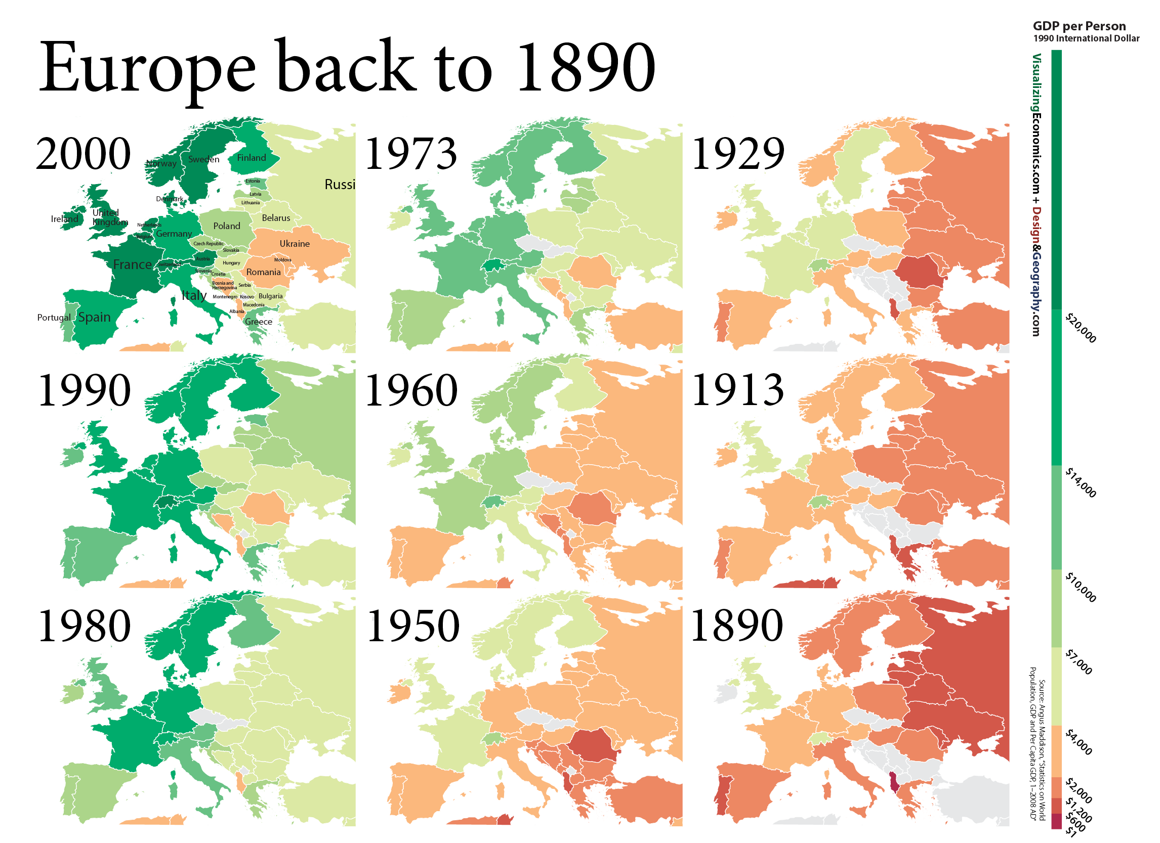
From a series of maps I created (with the help of my urban geographer brother) it is the growth of Europe across 110 years with nine maps. Data is adjusted for inflation.
Data from Maddison Project

From a series of maps I created (with the help of my urban geographer brother) it is the growth of Europe across 110 years with nine maps. Data is adjusted for inflation.
Data from Maddison Project
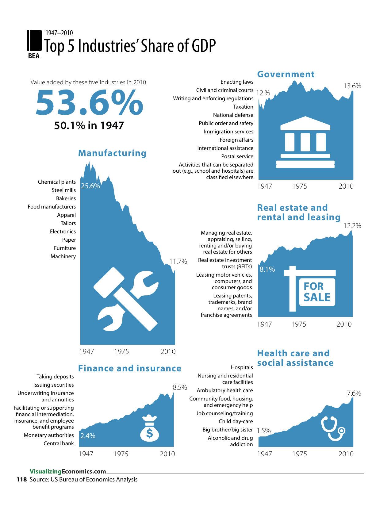
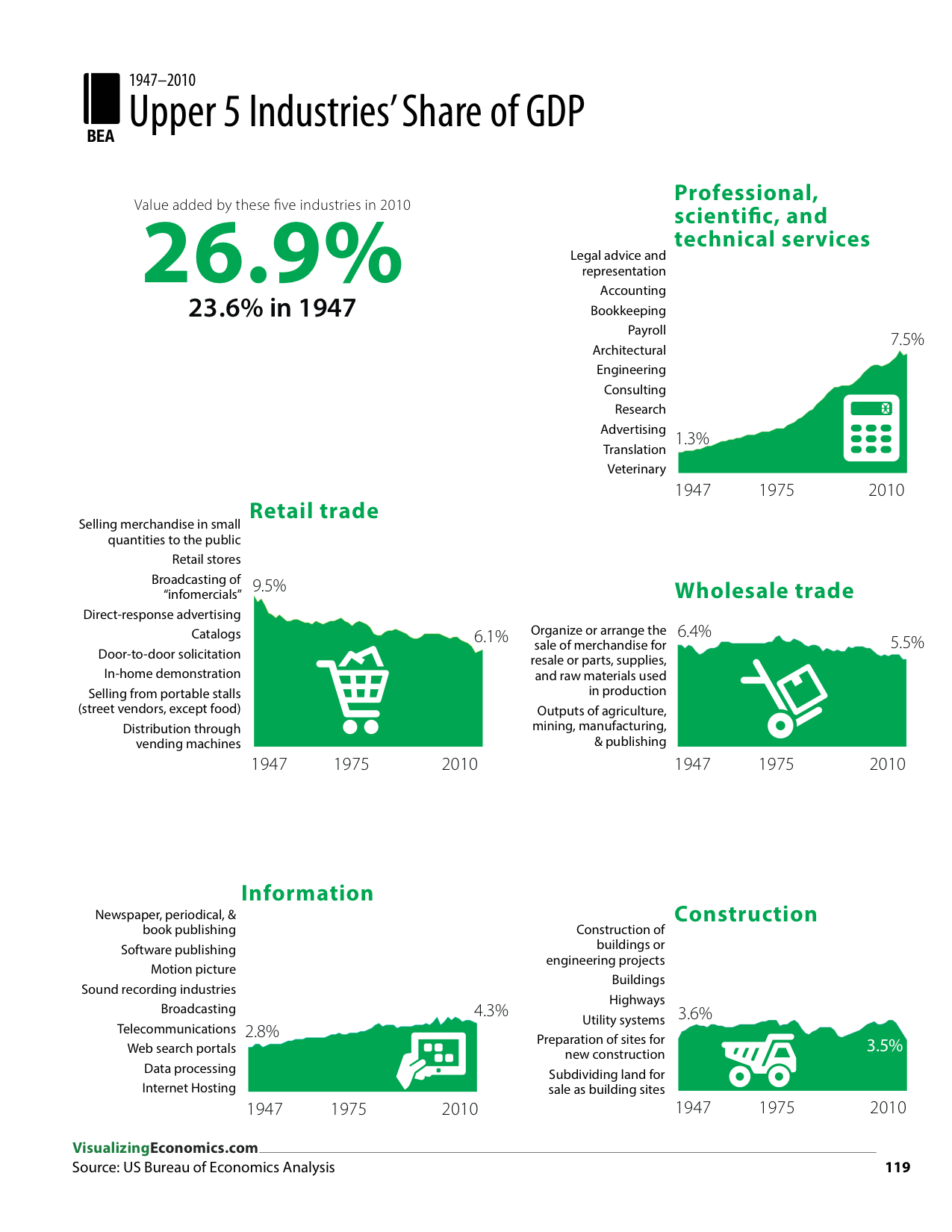
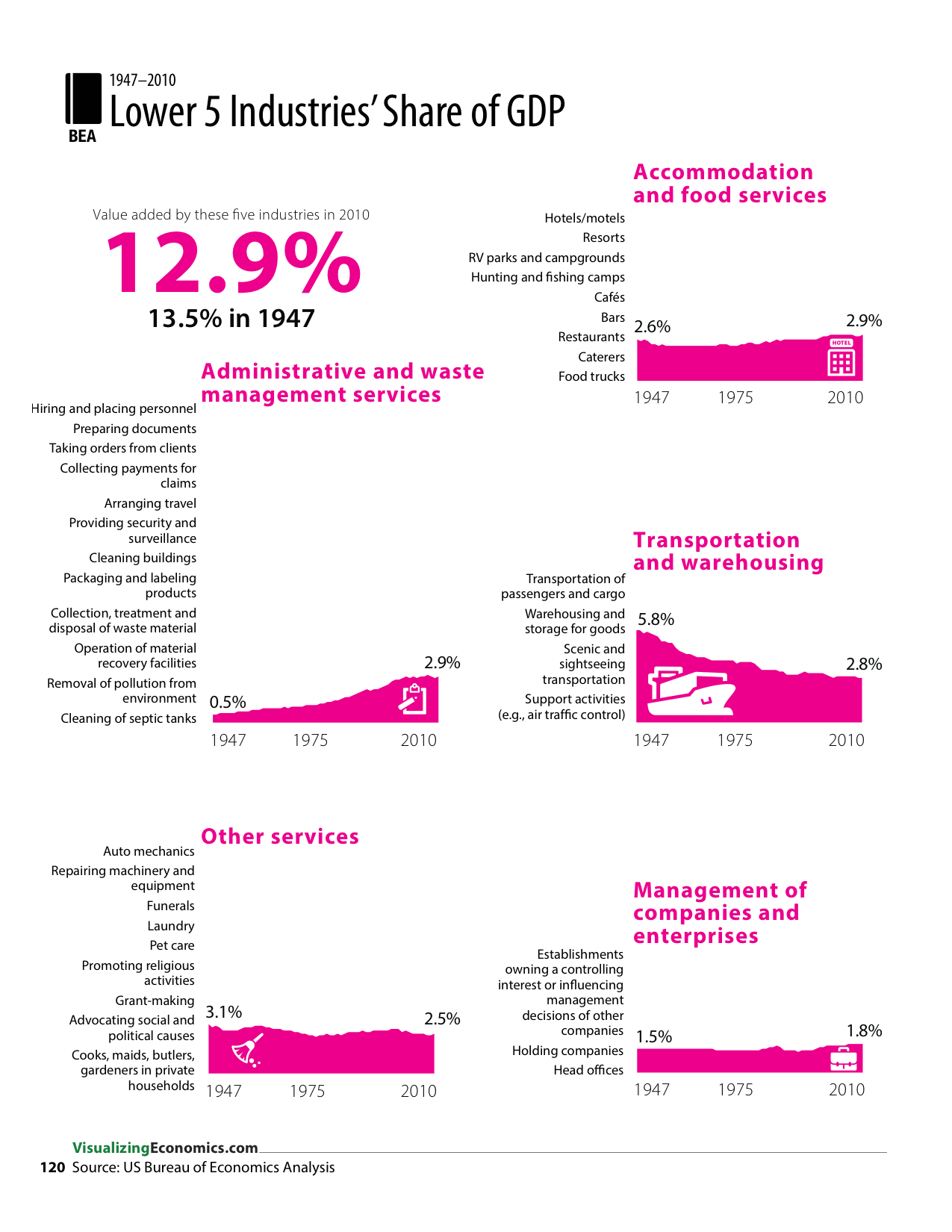
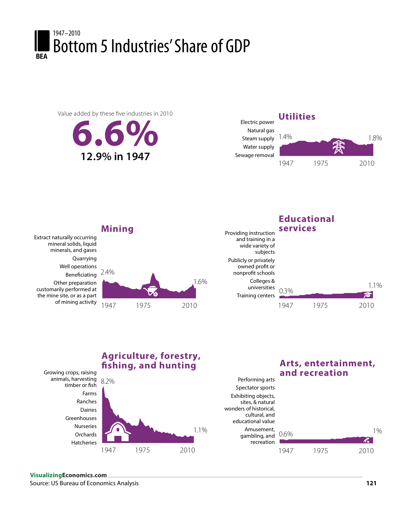
During the course of making my book, I took a look at the GDP Industry data from the Bureau of Economics Analysis and I decided to graph the 60 years of data showing the share of each industry in the US economy. Each graph is on the same x- and y-scales to support comparisons across all of them. At the same time I thought it would be helpful to list out some of the activities found in each industry so that these charts could be used as an introduction to the dataset. FInally, I ordered the industries from the largest to smallest across four pages.
Each area graph was created with OmniGraphSketcher and the final layout and annotations were made using Illustrator.
Datasource: US Bureau of Economic Analysis. “Gross Domestic Product (GDP) by Industry Data.” June 2012. http://www.bea.gov/industry/gdpbyind_data.htm.
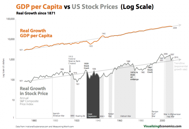
After receiving requests to use some of my graphs in textbooks, emails from teachers and recommendations by EducationWorld and the Library of Congress, I decided to create a series of Powerpoint presentations for teachers. In my first Powerpoint slide deck, I have created and updated examples of exponential growth in economics and finance. This historical data is annotated by major events and covers, in some cases, 200 years of US history. They are useful for interdisciplinary classwork in economics, social studies history as well as math. Besides demonstrating how the logarithmic scale works, this collection of graphs provides examples that show how log scales can illustrate percent changes and growth rates.
I release my work with a CREATIVE COMMONS BY-NC license so you are free to share/copy these graphs for educational or personal use after you purchase it.
See other product for sale in my shop.
Comparing Real GDP per Capita growth to the real growth in S&P Composite (price only). However, the stock price series is adjusted for inflation using CPI-U while the GDP per Capita (from MesuringWorth.com) is adjusted with the GDP Deflator.
Annualized growth rate of since 1871:Real GDP per Capita = 2.0%Real stock price return = 1.9% compared to Real total return with dividends reinvested = 6.2%
Data from MeasuringWorth.com and IrrationalExuberance.com
Six real word examples of exponential growth in a Powerpoint slide show (3.7 MB) that includes 11 graphs of economic and financial data (linear and log scale). Data is from MeasuringWorth.org, Yahoo Finance, and Irrational Exuberance. Links to the data sets are included in the file. Images can be printed (B&W or color) for handouts.
These graphs illustrate historical data series with constant growth rates and data series with changing growth rates over time. In addition, there is a example of adding/subtracting growth rates in log graph using US GDP, US Population & US GDP per person.
*** A few of people have had difficulty downloading in Firefox, if the download link does not work, try to copying the link into another browser. ***

New graph I created looking at long-term growth of US GDP per capita, very similar to my earlier graph of US GDP. Will post log version later this week.
Data from MeasuringWorth.com
