Mastodon

Income

Where Do the Rich and Poor Live?

One of the most popular maps I have on my site I got from a site called Social Explorer. It is about the 2000 poverty rates across the US. For my Illustrated Guide to Income in the United States, I created an new map using data through 2010 and a "divergent" color scheme which sets the light gray midpoint at the national poverty rate of 14%. Red are counties with a higher rate of poverty than the national rate while blue counties have a lower rate.

I also looked at the households with more than $200,000 a year and mapped where they are clustered. (BTW, if you want to see the voting patterns of high-income counties  and find out if the wealthy counties voted for Obama or Romney check out a map I created for Design & Geography). 

Related Posts Plugin for WordPress, Blogger...

Finding Good Jobs Without a Degree

First, what do I mean by good job? Well-paid? High level of job satisfaction? Lots of job security?

From heteconomist: Why so many jobs are crappy

Satisfying jobs – let's call them 'good jobs' – will generally be ones where learning occurs at a steady pace more or less indefinitely, probably as part of a defined career path. [...] Once you gain experience in a good job, you will soon become much more efficient in the role than an inexperienced replacement would be.

Summarizing this post, MarginalRevolution comments

The first key point is that if you learn more on the job on a regular basis (i.e., your job is interesting), you become harder to replace from the point of view of your boss.  Over time you win more of the bargaining surplus. 

So looking at my treemaps of occupations from An Illustrated Guide to Income in the United States, I have a category called "Long-term on-the-job training" defined as:

More than 12 months of on-the-job training or, alternatively, combined work experience and formal classroom instruction, are needed for workers to develop the skills to attain competency. Training is occupation specific rather than job specific; therefore, skills learned can be transferred to another job in the same occupation. This on-the-job training category also includes employer-sponsored training programs.

This sound like some of the "good jobs" people are looking for that don't require a college degree.

​Click on images to enlarge.

WIth this data graphic, I wanted to give an overview of all occupations grouped by the education/training required. The size of each rectangle represents the number of jobs.

Occupations like: electricians, carpenters, farmers & ranchers, restaurant cooks, photographers, police & sheriff's patrol offices can be found in  "Long-term on-the-job training".

The last three occupations (restaurants cooks, photographers, police & sheriff's patrol offices) increased in number of jobs from 2001-2011.

To learn more about which industries have a high number of  "long-term on-the-job training" jobs, first check out pages 128-148 in my book and then goto the BLS's Occupational Handbook to search for more jobs with long-term on-the-job training but no college requirement.

Data for the occupation treemaps was provide by EMSI based on data from Bureau of Labor Statistics (BLS).

Related Posts Plugin for WordPress, Blogger...

Stagnating Wages but Increasing Incomes

More excerpts from An Illustrated Guide to Income in the United States (Pages 66, 68, 69) .

In my previous post, I looked at wages, showing that for many occupations, they have not kept up with the overall growth of the economy. But what about the growing number households with incomes well above the national average of $67,500? (Focus on the orange lines/area in the 3 graphs below)

Click on the images for a closer look. This will open a lightbox the same size as the browser window.

In 1945, less than 10% of family households had incomes above $80,000 (adjusted for inflation) steadily increasing to 30% in the late 1990s. They continued to increase up until 2000 even while wages flatten or dropped.

Looking at the bottom graph, the number of family households with two earners grew and surpassed number of single earner household in the late 1960s. This growth mirrors the growth of families with $80,000 or more a year. One can easily assume that second earner in these households were women as women entered the labor force in larger numbers boosting their family's income. 

Note: Single people living alone are not included in "Family Households," bottom graph, but are included in "All Households," top graph.

In 2010, 72% of the households with income above $80,000 a year have two or more earners compared to 41% of households with income between $30,000 and $80,000. It is this increase in the number of two-earner households that accounts for household incomes increasing when wages have not. 

To learn more about Income in the US buy or read the book.


Data for households came from the US Census

US Census Bureau. “Historical Income Tables: Households.” June 2011. http://www.census.gov/hhes/www/income/data/historical/household/index.html.

US Census Bureau. “Table HINC-01. Selected Characteristics of Households, by Total Money Income in 2010.” 2012. http://www.census.gov/hhes/www/cpstables/032011/hhinc/new01_001.htm

 (See bibliography for additional data) 


Related Posts Plugin for WordPress, Blogger...

What Happened to Wages?

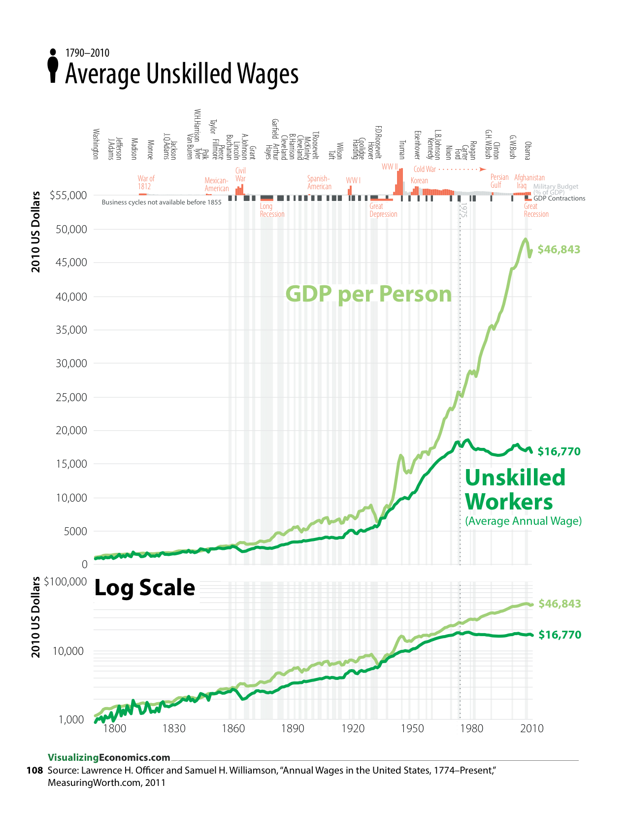
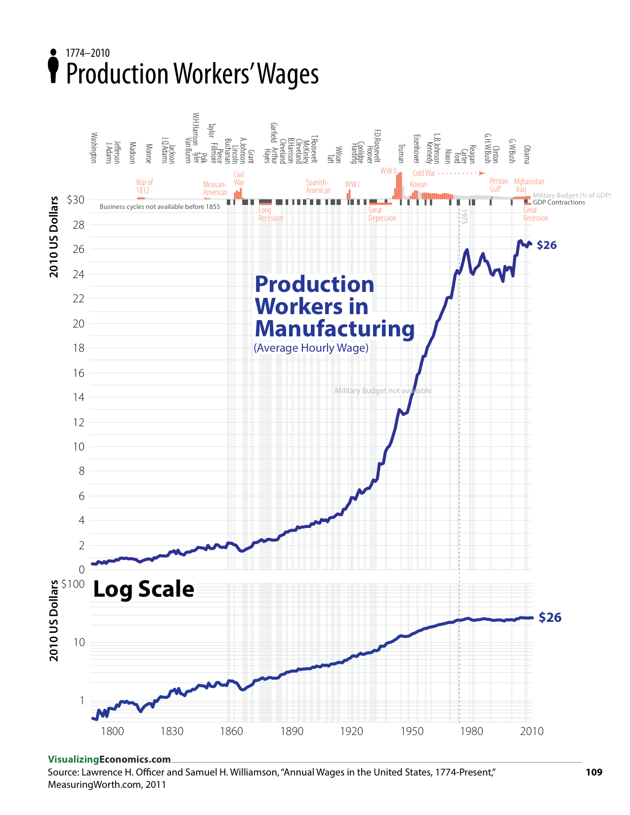
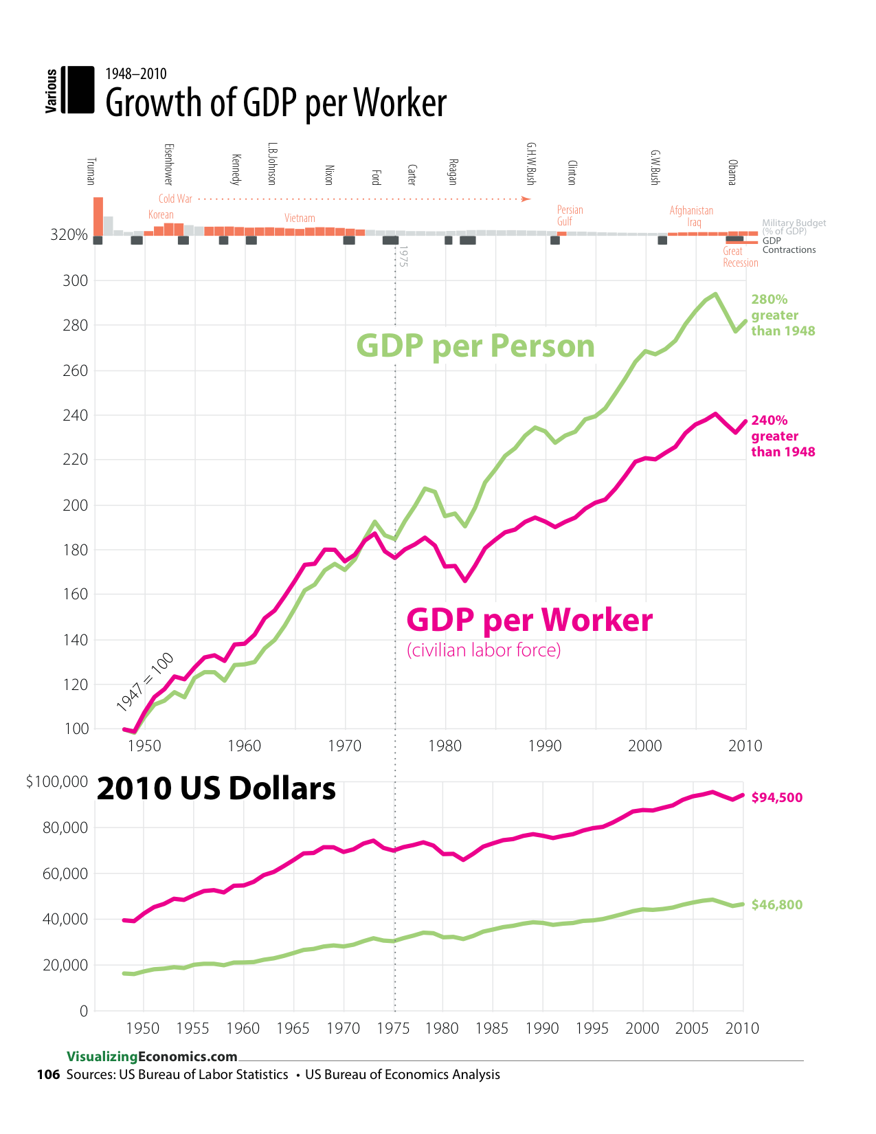
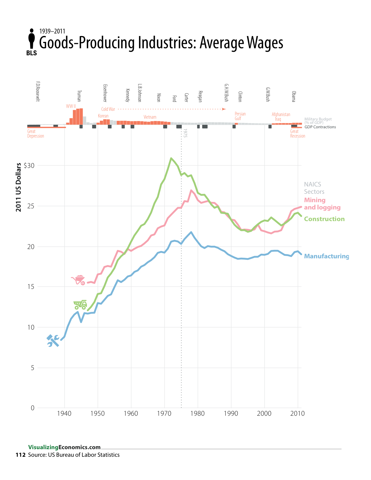
Below are five data graphics from my new book An Illustrated Guide to Income in the United States (pgs 106, 108, 109, 110, 112) that shows the long-term growth in wages in the US.


Click on the images for a closer look. This will open a lightbox the same size as the browser window.

Over the last couple of centuries there has been a steady increase in wages for both unskilled workers...

....and production workers. A lot of this growth is a result of the increases in worker productivity due the industrial revolution of the late 1770s and 1800s. However, over the last 40 years, this long-term growth has stopped or slowed down...

Updated 3/25/13: This Production Workers series includes benefits all the way back to when benefits became measurable in the early 1900s. More detailed definition can be found here.


...even though the GDP per person continues to grow. At the same time, the growth rate of GDP per worker has slowed compared to the overall growth of the economy.

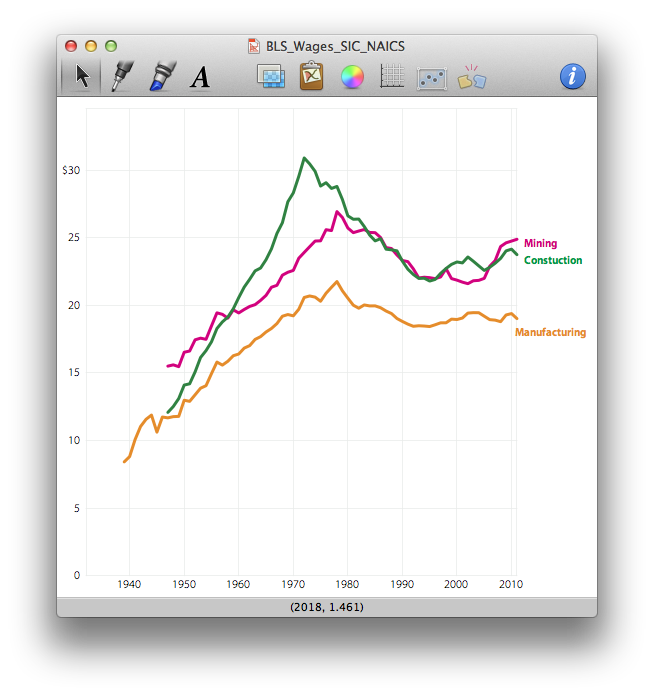
Looking at just goods-producing industries, wages dropped for manufacturing, construction, and mining & logging since their a peak in the 1970s.


But among so-called service industries over the same time period there has been either a dip in wages or no real growth. Exceptions include jobs in the financial industry, education & health services and "other" services (which is mashup of occupations like auto mechanics, pet care, promoting political causes or religious activities). 

Data Sources for Wages (See bibliography for more references)

Officer, Lawrence H., and Samuel H. Williamson. “Annual Wages in the United States, 1774–Present.” MeasuringWorth.com, 2011. http://www.measuringworth.com/uswage/

US Bureau of Labor Statistics. “Table B-8. Average hourly and weekly earnings of production and nonsupervisory employees on private nonfarm payrolls by industry sector, seasonally adjusted.” November 2012. http://www.bls.gov/webapps/legacy/cesbtab8.htm


Designer's Notes: Some of my thoughts on the design and the approaches I used. 

Related Posts Plugin for WordPress, Blogger...

Inequality in New York City 2009

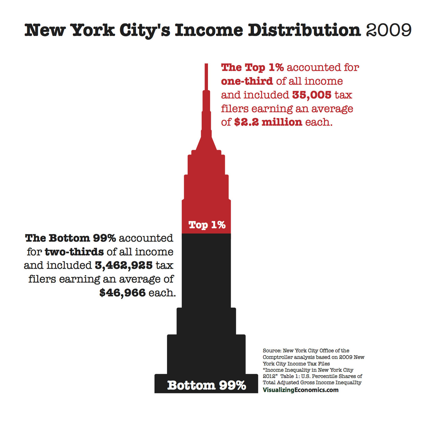
I was asked a while back to work on a cover for a report “Income Inequality in New York City” published by New York City Comptroller’s Office. Their analysis of the 2009 New York City Income Tax Files breakout the share of income going to the top 1% and other income groups. While my graphics were not used for the cover, you can take a look at two versions I mocked up based on some their data and cover ideas.

Related Posts Plugin for WordPress, Blogger...