
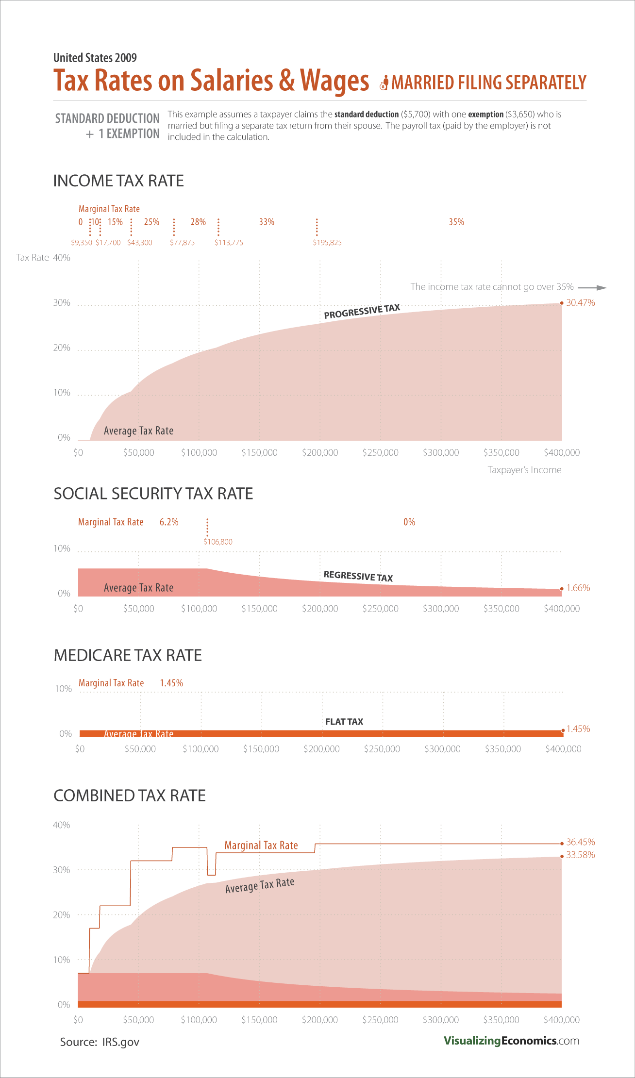
The fourth in series of infographics I am designing to illustrate the average federal tax rate applied to different salaries. This time I am graphing the average tax rates for someone while married is filing a separate tax return from their spouse. The difference between this graph and that of a single taxpayer is that the cut offs for 28%, 33% and 35% rates are lower which will increases the average tax rates for people with an income over $78,000.
The income tax graph is created from the 2009 tax schedule for someone married filing separately from their spouse:
