From An Illustrated Guide to Income in the United States.
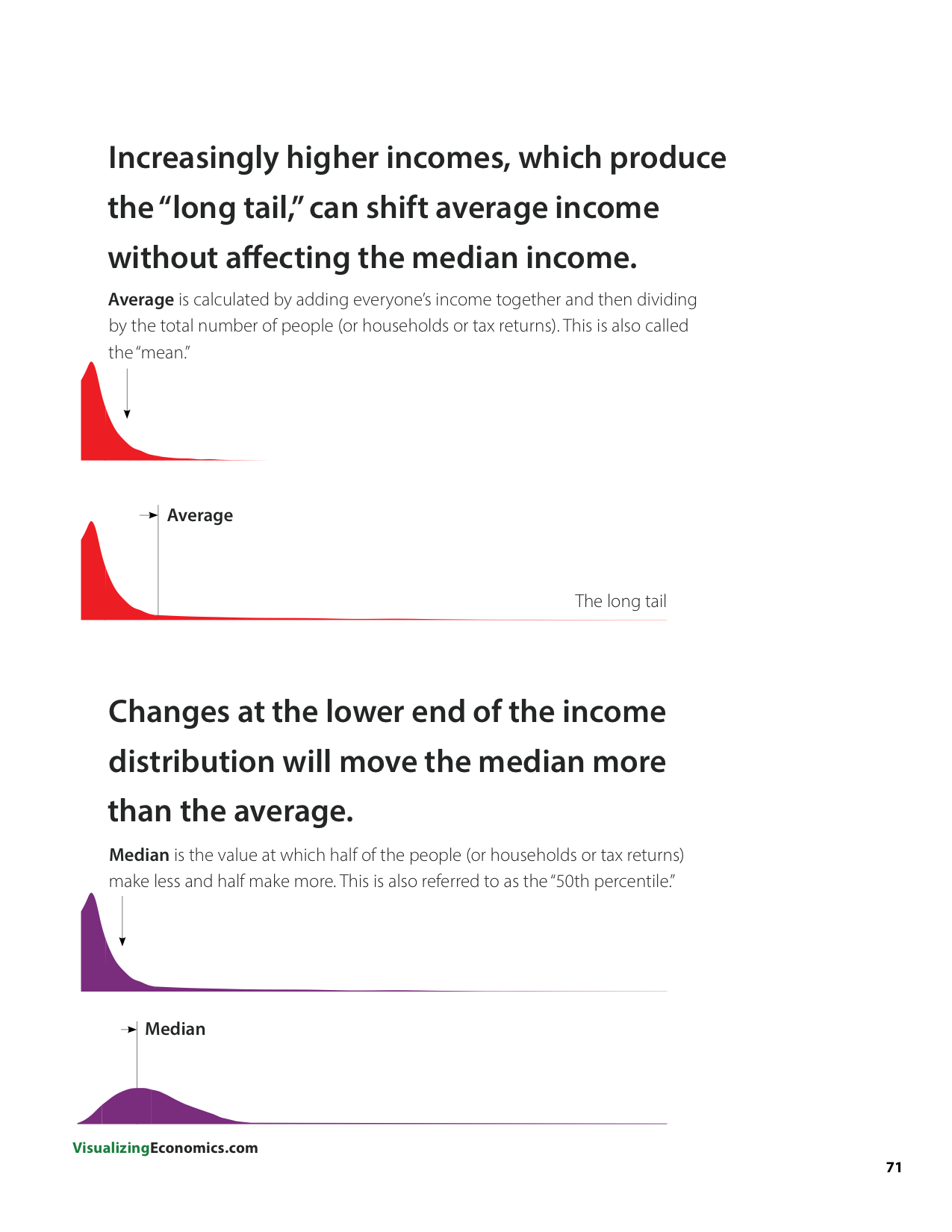
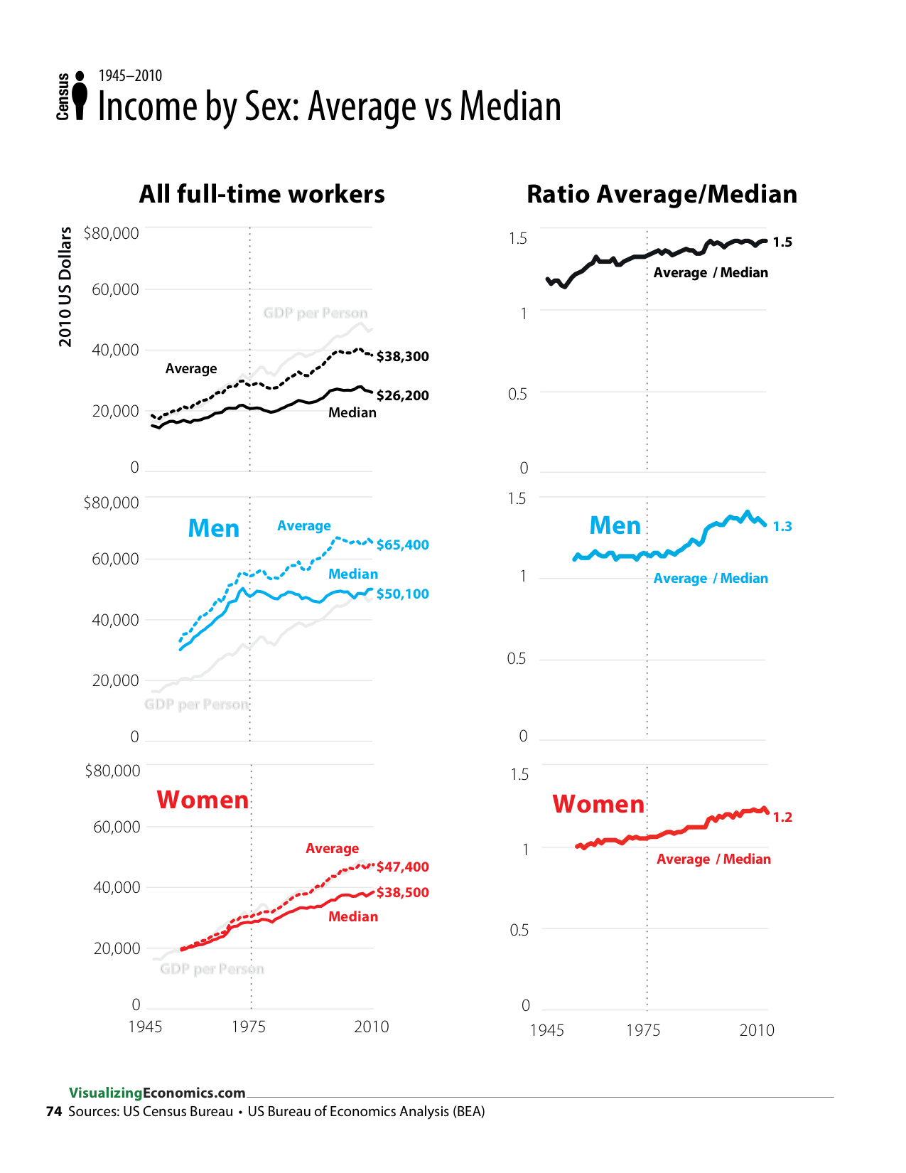
Growing income inequality can be seen across many different statistics in my book. For example when average and median incomes diverge, this is a red flag for growing inequality since the increasingly higher incomes that can be found among corporate executives, celebrity and hedge fund mangers can shift average income without affecting the median* income.
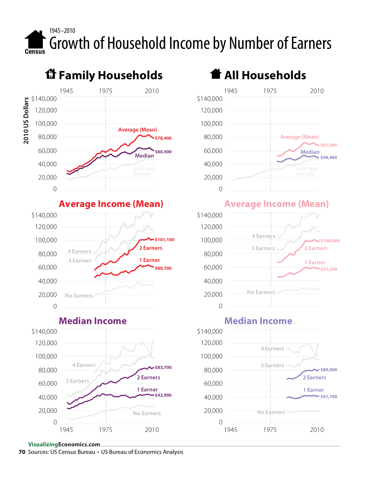
Take a look at how the average (mean) and median income diverge for family households over the last 35 years. This implies that the income growth of lower-income households has not kept up with the income growth high-income households. Over the same time period, the median income of family households with only 1 income earner didn't change while the median income of 2, 3, 4 and no earner households continued to grow.
When I took a look at gender, I saw that the average income grew faster than the median for both men and women. However, for men, this divergence of average and median income started after the late-1970s, when their median income growth flatten (similar to lack of growth in the 1 earner households). However, for women this divergence of average and median income is not as dramatic and can be seen back to the 1950s.
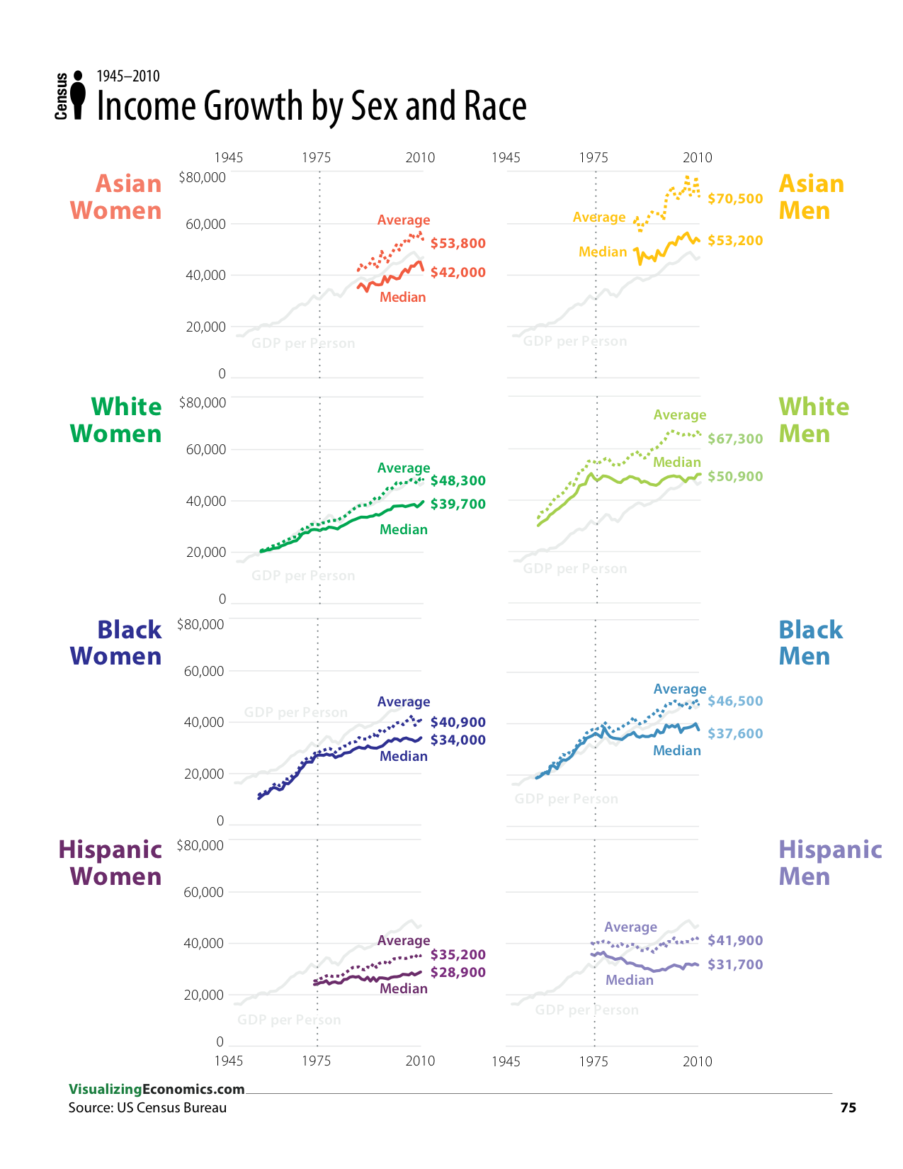
Also interesting was that this pattern (no growth of median income since the late-1970s with continued growth of average income) was very clear in their chart for white men. Especially compared to the other race/sex combinations.
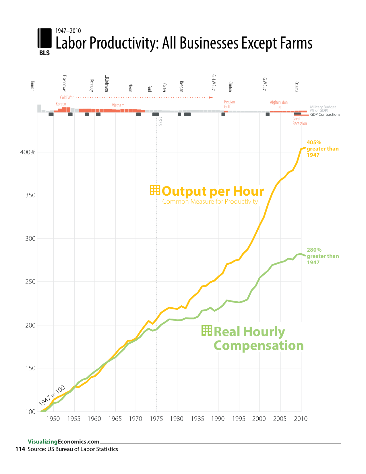
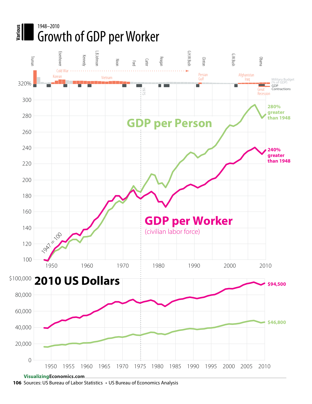
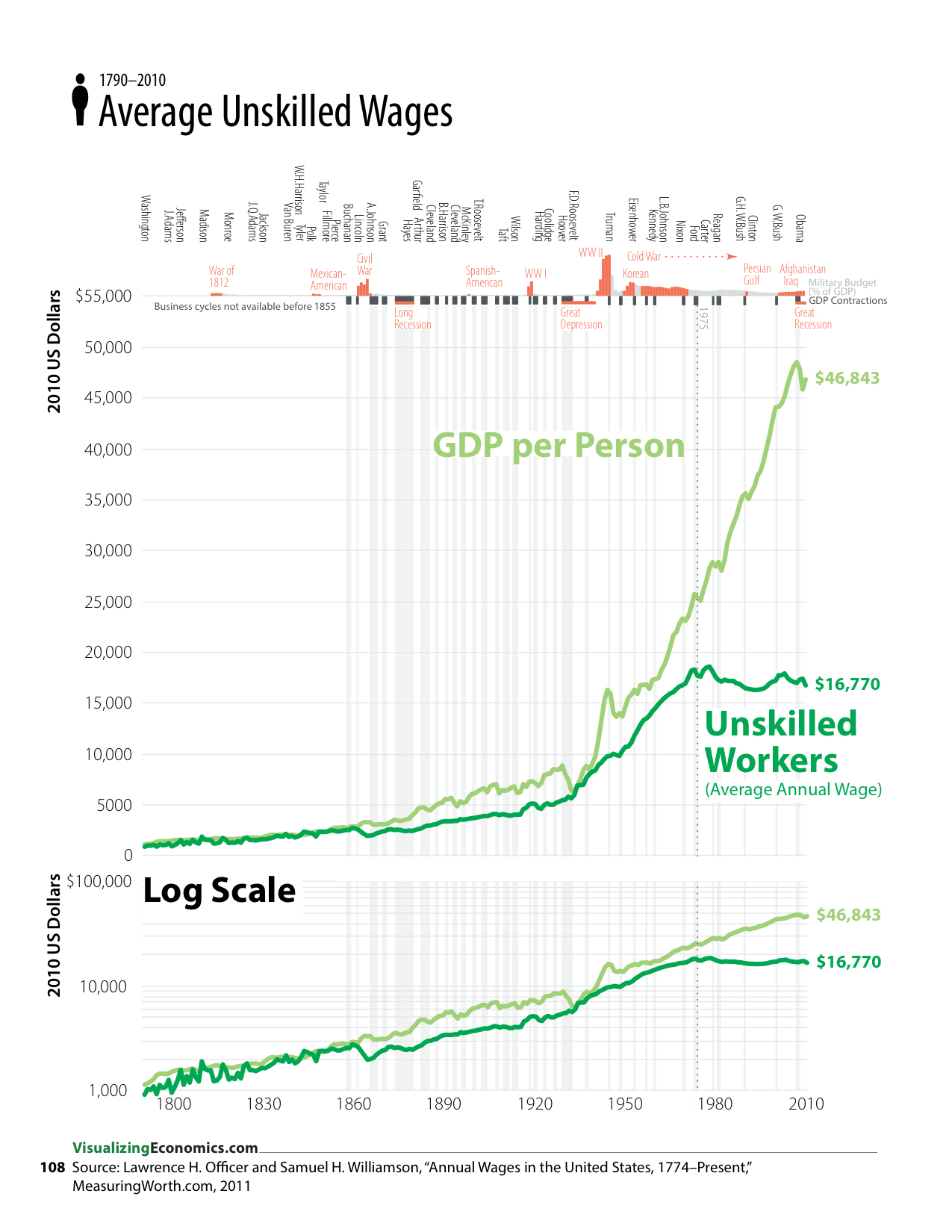
Finally, I saw this visual pattern (a change in the growth rates since the 1970s) when comparing the growth of
- GDP per Person vs GDP per Worker
- GDP per Person vs Average Unskilled Wages
- Labor Productivity (Output per Hour) vs Real Hourly Compensation
*Median is the value at which half of the people (or households or tax returns) make less and half make more. This is also referred to as the “50th percentile.”
Read Online to view all to the graphics from my book. These graphs were created using OmniGraphSketcher copied into Adobe Illustrator for additional annotations.
Data from
Officer, Lawrence H., and Samuel H. Williamson. “Annual Wages in the United States, 1774–Present.” MeasuringWorth.com, 2011. http://www.measuringworth.com/uswage/.
US Census Bureau. “Historical Income Tables: Households.” June 2011. http://www.census.gov/hhes/www/income/data/historical/household/index.html.
US Bureau of Economic Analysis. “Gross Domestic Product (GDP) by Industry Data.” June 2012. http://www.bea.gov/industry/gdpbyind_data.htm.
US Bureau of Labor Statistics