Mastodon

Text Graphic

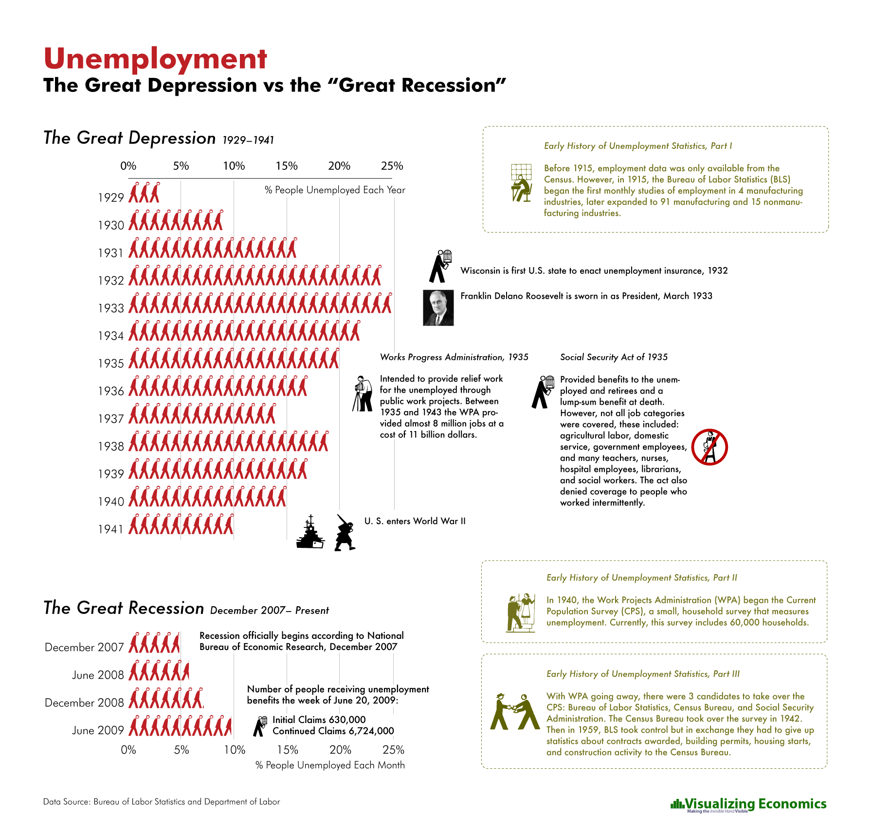
Prices, Inflation and Deflation: Great Depression vs Great Recession

Another infographic comparing the last 18 months to the Great Depression. This time I am focusing on Prices, Inflation and Deflation.

Inflation 1930s
Related Posts Plugin for WordPress, Blogger...

Data Scientist > Data Geek > Designer

Reading Nathan Yau's recent post about the Rise of the Data Scientist inspired me to take a look Ben Fry's dissertation on Computational Information Design in which he describes the process for understanding data as follows:

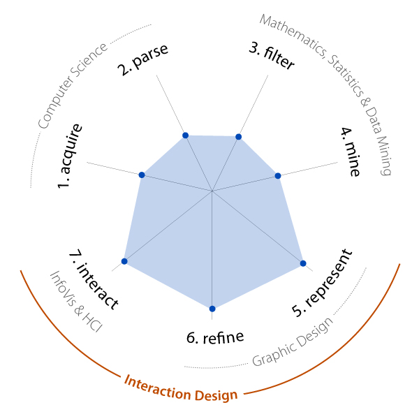
  1. acquire – the matter of obtaining the data, whether from a file on a disk or from a source over a network.
  2. parse – providing some structure around what the data means, ordering it into categories.
  3. filter – removing all but the data of interest.
  4. mine – the application of methods from statistics or data mining, as a way to discern patterns or place the data in mathematical context.
  5. represent – determination of a simple representation, whether the data takes one of many shapes such as a bar graph, list, or tree.
  6. refine – improvements to the basic representation to make it clearer and more visually engaging.
  7. interact – the addition of methods for manipulating the data or controlling what features are visible.
CompInfoDesign

I took his process and created a diagram that maps my own skill set with the addition of Interaction Design (my current profession) which I believe covers the represent, refine, and interact steps.

While I don't disagree that these steps represent the process for understanding data for the individual creating the data visualization, they don't cover a step needed to create a design that is readily understood or that is persuasive to others.

CompInfoDesign_2-01

User research and testing of the design is needed to verify that the representation is clear and appropriate. Although this could be considered part of the refine step, it may be needed at other points in the process (i.e. represent, or interact). For anyone who is interested in creating data visualizations for other people, it should be considered an important part of the design process.

Related Posts Plugin for WordPress, Blogger...

Seattle Poverty Map

Seattle Percent in Poverty

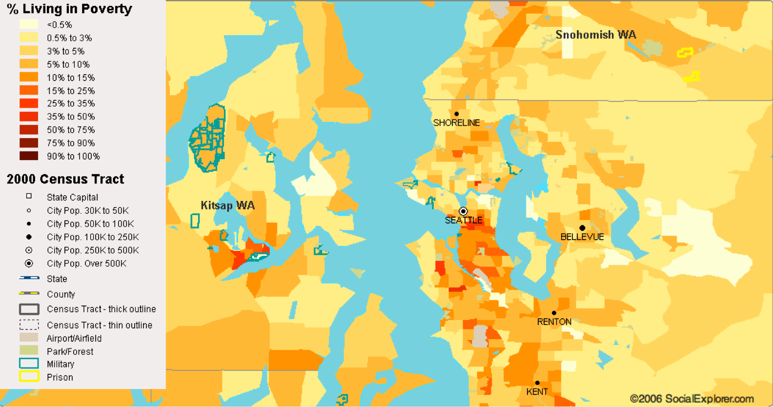
Here is my fifth entry in my series on US Cities. Using 2000 Census data I have mapped % of people living in poverty in the Seattle metropolitan area. you can find the original interactive map at Social Explorer Choose "Poverty" from the second drop down, then select the magnifying glass to zoom in on Seattle. 

For reference, I am including a Google map of Seattle. You can use this map just like the regular Google map and close the white message box.

Related Posts Plugin for WordPress, Blogger...

San Francisco-Oakland Poverty Map

San Francisco-Oakland Percent in Poverty
magnafing glass

This is my fourth entry in my series on US Cities. Using 2000 Census data I have mapped % of people living in poverty in the San Francisco-Oakland metropolitan area. If you would like to see the original interactive map go to Social Explorer and choose "Poverty" from the second drop-down, then select the magnifying glass to zoom in on San Francisco-Oakland. 

For reference, I am including a Google map of San Francisco-Oakland. You can use this map just like the regular Google map and close the white message box.

[googlemaps https://maps.google.com/maps?q=San+Francisco,+CA,+USA&ie=UTF8&ll=37.840157,-122.386322&spn=0.486265,0.891953&t=h&z=11&om=1&output=embed&s=AARTsJrjhWfMHFd-MiN15_i3xQfyIrsGDQ&w=500&h=500]

See also:United States Poverty Map

Related Posts Plugin for WordPress, Blogger...