Mastodon

Africa

Making Sense out of Numbers

I was able to attend the Seminar on Innovative Approaches to Turn Statistics into Knowledge held at the Census Bureau in DC last week. It was an interesting mix of officials from government statistical offices, central banks with academics and designer/data geeks. Some of the highlights: Amanda Cox from the New York Time talking about how she is a like a tour bus driver describing the interesting stuff she finds, That she believes in visualizations that pull something forward while pushing back the rest of the data, have an annotation layer. Also that distributions are more interesting than averages, and when you have something move make sure you know why it is moving. Some of these principals you can see here and here

Helen North from the South Africa's Stats Office talking about the need to build trust in the data as well as to educate people in the uses of their data. This was accomplished by bringing together the delegates from the local municipalities so that they could learn about, discuss and debate with each other the demographic statistics collected about their home districts.

Irene Ros from ManyEyes talking about people uploading their personnel data (Warcraft stats, Facebook friends). She described how hey were using this tool to create "Data Mirrors" i.e. a picture about themselves. Also she mentioned that 88% of Wordle users feel creative when using the tool.

Jim Ridgway from Durham University's Smart Centre talked about students (14-15 year old) when face with a media story and data about the same subject were able to critique the story using the data and in some case spontaneously found more data to include in their critique.

David Spiegelhalter from Cambridge University demonstrated a very interesting site designs used to explain uncertainty to people. He stressed that there was no one right method as different people responded to different methods. During the discussion he brought up an important point to keep in mind when creating visualizations: what is the purpose behind the visualizations? Is it the

  1. WOW! reaction?
  2. to increase knowledge?
  3. or to effect behavior?
Related Posts Plugin for WordPress, Blogger...

Share of GDP: China, India, Japan, Latin America, Western Europe, United States

After coming across this graph about the share of world GDP (China, India, and US), I started to wonder what was the percentage back to 1500? The graph below shows the share of GDP over the last 500 years for China, India, Japan, Latin America, Western Europe, and United States. (Keep in mind that the change in population size will effect the size of the GDP)


Population growth since 1500

Data estimates for GDP from Angus Maddison Emeritus Professor, Faculty of Economics, University of Groningen.

See also:

Last 2,000 years of growth in world income and population

Related Posts Plugin for WordPress, Blogger...

Share of Population Growth: China, India, Africa, Latin America, Western Europe, United States

Population growth since 1500

Here, I have graphed the percent of world population over the last 500 years for China, India, Africa, Latin America, Western Europe, and United States. This is a companion graph to Comparing Population Growth: China, India, Africa, Latin America, Western Europe, United States

See also: China: 2,000 Years of Income and Population GrowthLast 2,000 years of growth in world income and population

Data estimates for population from Angus Maddison Emeritus Professor, Faculty of Economics, University of Groningen.


Related Posts Plugin for WordPress, Blogger...

United States vs Great Britain (Revised)

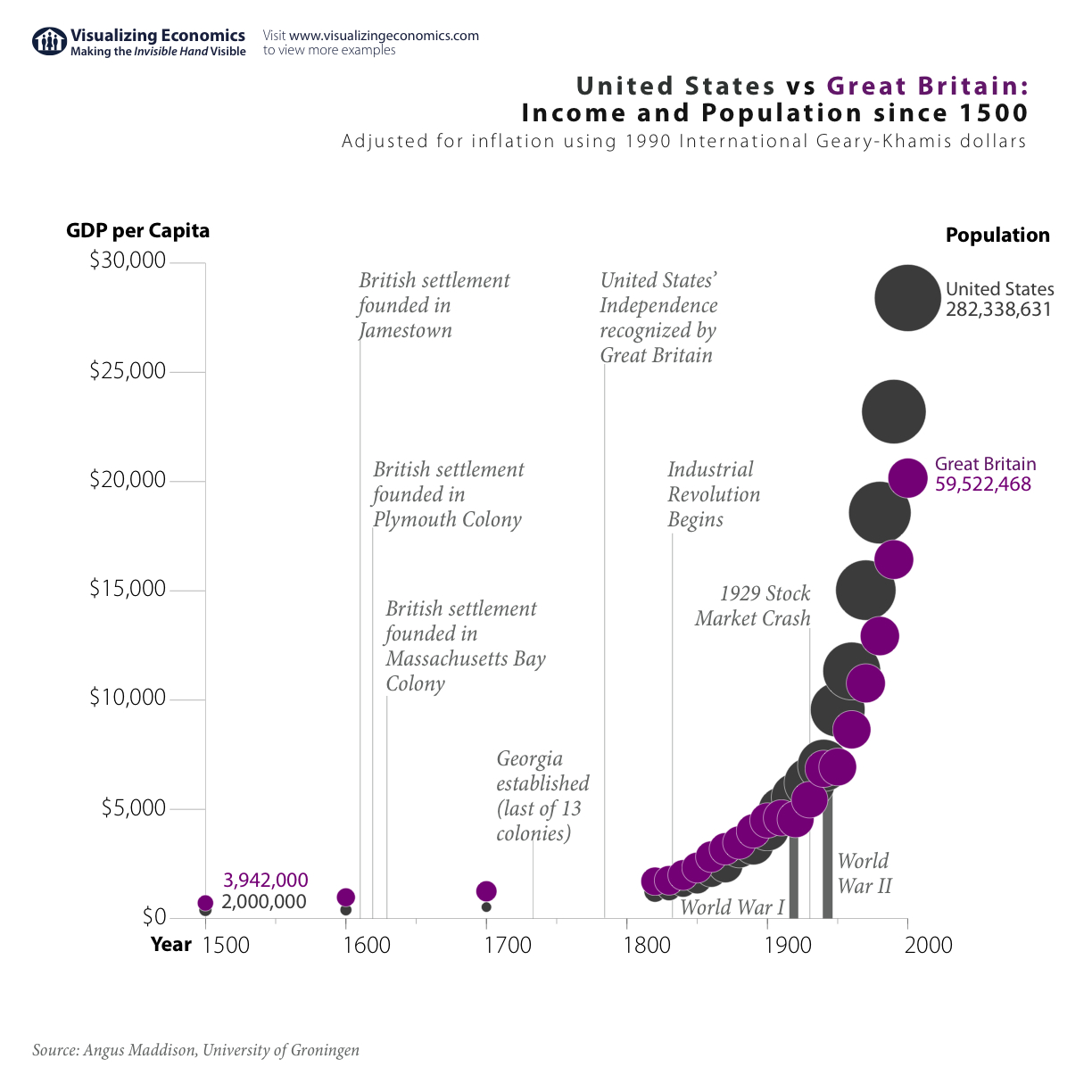
I am revisiting my previous graph United States vs Great Britain: Income and Population since 1500. In my original graph, I placed population on the y-axis which emphasizes its dramatic growth in the US. In the new graph, I placed GDP per Capita on the y-axis which emphasizes the growth in income in both countries. Take a look below at both versions and let me know which you prefer:

New Version: GDP per Capita on the y-axis {Click on the image to take a closer look}

UK Income and Population growth since 1500
magnifying glass

Original Version: Population on the y-axis {Click on the image to take a closer look}

UK Income and Population growth since 1500
Related Posts Plugin for WordPress, Blogger...

United States vs Great Britain: Income and Population since 1500

UK Income and Population growth since 1500

Comparing United States vs Great Britain's income and population over the last 500 years shows how the US eventually over took Britain. Keep in mind that GDP per Capita for both countries are in 1990 international Geary-Khamis dollars, calculated from purchasing power parities (PPPs) of currencies and average prices of commodities. {Click on the image to take a closer look}

See also:United States: 500 Years of Income and Population GrowthComparing Population Growth: China, India, Africa, Latin America, Western Europe, United StatesChina: 2,000 Years of Income and Population GrowthLast 2,000 years of growth in world income and population

Data estimates for population from Angus Maddison Emeritus Professor, Faculty of Economics, University of Groningen.

Related Posts Plugin for WordPress, Blogger...