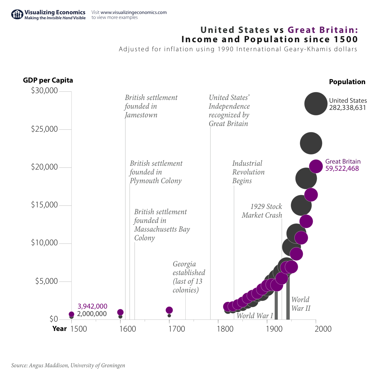
I am revisiting my previous graph United States vs Great Britain: Income and Population since 1500. In my original graph, I placed population on the y-axis which emphasizes its dramatic growth in the US. In the new graph, I placed GDP per Capita on the y-axis which emphasizes the growth in income in both countries. Take a look below at both versions and let me know which you prefer:
New Version: GDP per Capita on the y-axis {Click on the image to take a closer look}

Original Version: Population on the y-axis {Click on the image to take a closer look}

See also:
United States: 500 Years of Income and Population Growth
Comparing Population Growth: China, India, Africa, Latin America, Western Europe, United States
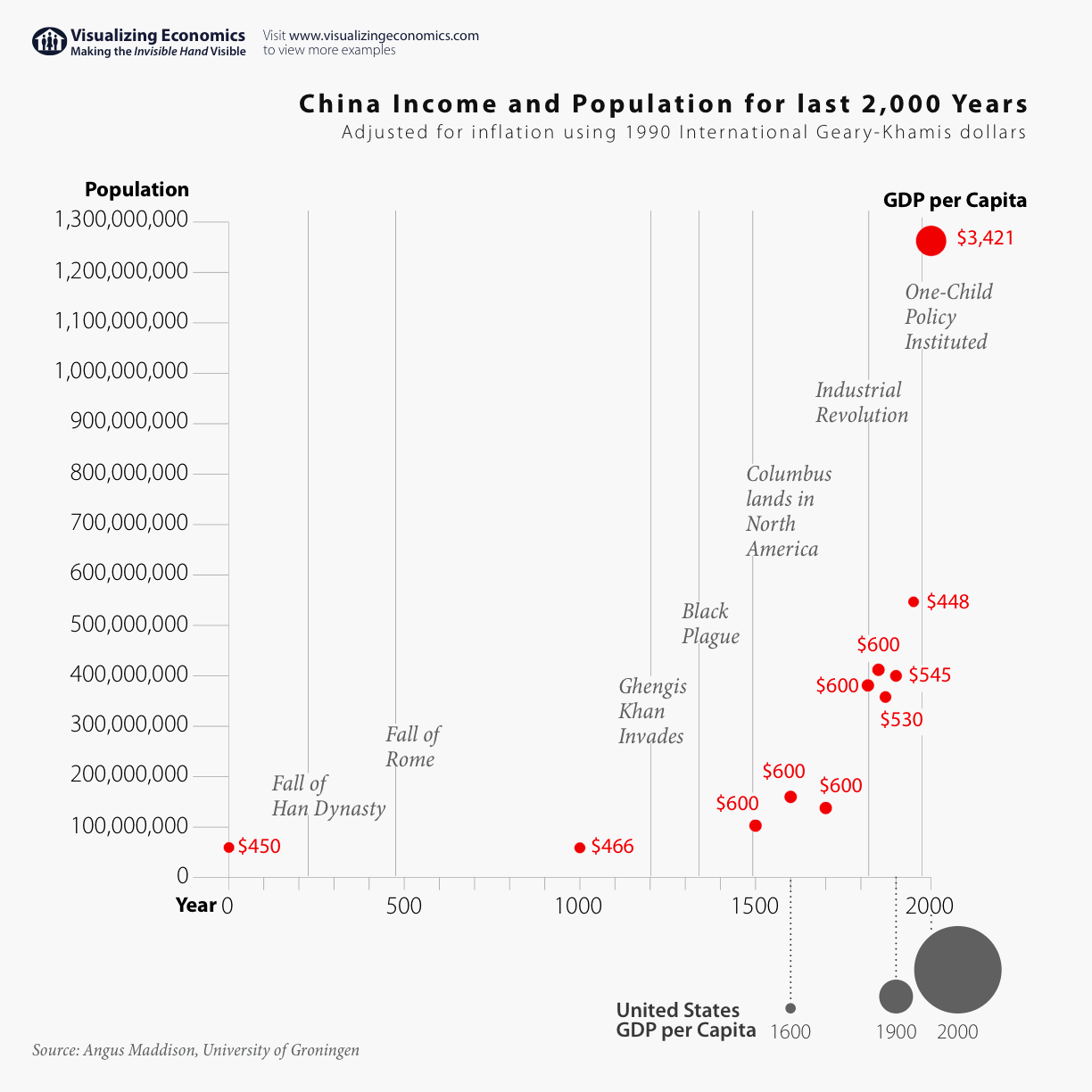
China: 2,000 Years of Income and Population Growth
Last 2,000 years of growth in world income and population
Data estimates for the population from Angus Maddison Emeritus Professor, Faculty of Economics, University of Groningen.