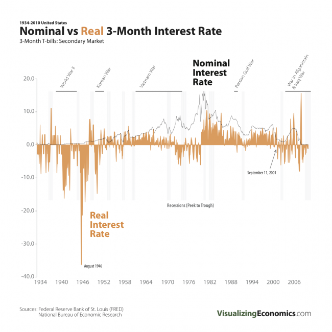
An update of my Nominal vs Real 3-Month Interest Rate graph through 2010.
Data for 3-Month Treasury Bill: Secondary Market Rate (TB3MS) and CPI-U (CPIAUCNS) from Federal Reserve Bank of St. Louis. Recessions dates can be found at NBER

An update of my Nominal vs Real 3-Month Interest Rate graph through 2010.
Data for 3-Month Treasury Bill: Secondary Market Rate (TB3MS) and CPI-U (CPIAUCNS) from Federal Reserve Bank of St. Louis. Recessions dates can be found at NBER

I plotted the historical spread between Effective Fed Funds rate and US 3-Month T-bills back to 1956 using the weekly average. This a companion graph to Anatomy of a Financial Crisis: September 2008
Data from Federal Reserve Bank of St. Louis


I have plotted the US 3-Month T-bills: Secondary Market rate (green line) vs the Effective Fed Funds rates (orange) for Sept 2008. The major events of the recent financial crisis have been included. {Click on the image to take a closer look}
Data from Federal Reserve Bank of St. Louis
I have plotted the 3-Month T-bills: Secondary Market rate (green line) vs the inflation adjusted (i.e. Real) 3-Month T-bills rate (orange) from Jan 1934-Sept 2008. The inflation number I used is CPI-U 3-month % change multiplied by 4.

Here is the annual percent change of inflation (CPI) in the Untied States from 1774 to 2007, which I graphed in my previous post, but this time I added historical events to the graph: Wars, Banking Panics, Pegging Paper Money to the Gold and Silver Standard, Establishment of the Federal Reserve and the US Mint. {Click on the image to take a closer look}
Data from MeasuringWorth.org