Mastodon

Forbes

Four Ways to Visualize US Income Inquality

During the course of making my book, I tried to solve the problem of representing the extreme income inequality in the United States using several different graphic approaches. In some cases, I was working with a single data set like The World Top Incomes Database or the Congressional Budget Office. In others graphics, I combined this data with data from Forbes, IRS, and AR: Absolute Returns + Alpha.

Treemap was created using R and the people icons were added in Illustrator, while the cumulative share graphs and the dot plots were create in OmniGraphSkecher.


Related Posts Plugin for WordPress, Blogger...

Annual income of three billion dollars?

Reading the Wealth Report I stumbled across The $3 Billion Payday

...hedge-funder John Paulson, who made somewhere between $3 billion and $4 billion last year. That's right, between $3 billion and $4 billion. In one year. To put that in perspective, Mr. Paulson's salary equals the incomes of 62,500 Americans earning the national median income of $48,000 a year. It also puts him instantly among the top 150 richest Americans, as measured by Forbes. Mr. Paulson made more in one year than The Donald has made in a lifetime.


I have tried to graph hedge fund manager income in the past but it is difficult to compare income of $50,000 with $3 billion on the same graph. Alternatively, I have compared CEO and hedge fund managers.

Related Posts Plugin for WordPress, Blogger...

2005 US Income Distribution part 3

I went back to my 2005 US Income Distribution graph but this time I looked at the income of everyone above $250,000. Although one can find lists of high income earners it is very difficult to find a graph plotting their earnings as compared to everyone else. The scale of the graph is so extreme that most of the population ends up looking like a dot at the bottom of the graph. Below I have created 3 graphs that try to show the relationship between the bottom 99.99% and the top 0.01%.

2005 Income Distribution Less than 5 million
2005 Income Distribution Less than 1 billion

The original Census data can be found at Table HINC-06. Income Distribution to $250,000 or More for Households

The bottom 99.99% I estimated from data found at Emmanuel Saez's web site

The CEO and Celebrity income estimates came from Forbes magazine

And finally the income for the top hedge fund managers was first published at Alpha magazine but I found it via the New York Times

See Also: Part 1 and Part 2 

Related Posts Plugin for WordPress, Blogger...

Is $1.5 billion the highest income in the World?

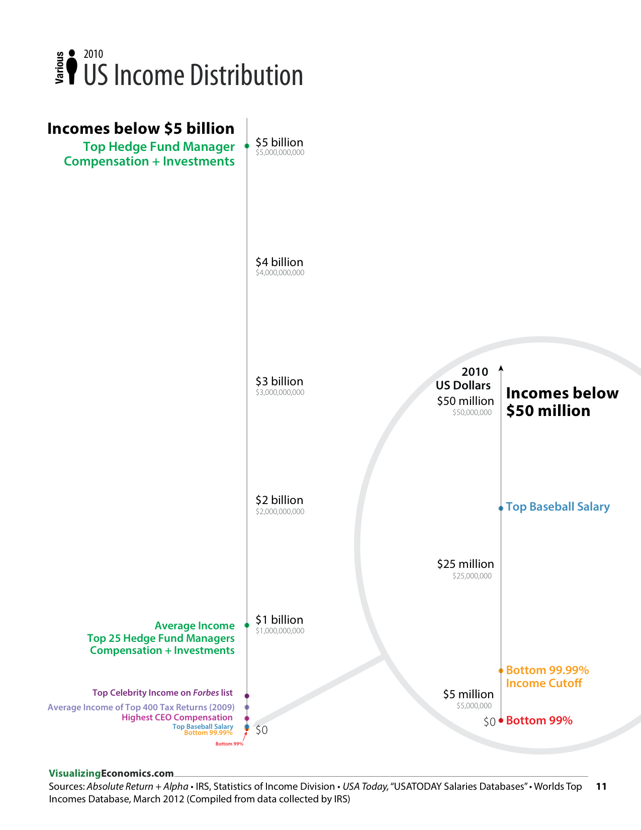
It is official. I am astonished by the size of some of the incomes reported for hedge fund managers. When I first heard about the $150 to $200 million dollar incomes for CEOs and Celebrities (reported by Forbes magazine) that was impressive. But apparently that is barely enough to make the top 25 incomes for hedge fund managers in 2005:

This time there are two who break the billion-dollar barrier: James Simons of Renaissance Technologies Corp. and BP Capital Management’s T. Boone Pickens. In 2005 math whiz Simons, we calculate, earned a staggering $1.5 billion, edging out oil tycoon Pickens, who took home an equally astounding $1.4 billion from two hedge funds he quietly launched ten years ago. . .


. . .One thing that never seems to change for this exclusive club: The cost of admission keeps going up. A manager had to earn at least $130 million in 2005 to qualify for a place among the top 25 money earners, compared with $100 million in last year’s survey and just $30 million in 2001 and 2002. The 26 managers on the list made, on average, $363 million in 2005, a 45 percent jump from the $251 million the top 25 earned in 2004. The average, of course, got a boost from the billion-dollar boys, Simons and Pickens. But the median earnings also grew, jumping by a third, from $153 million in 2004 to $205 million last year.


Related Posts Plugin for WordPress, Blogger...

United States' Estate Tax Returns 1916-2000

If you are looking for a possible explanation for dramatic change in income I showed in my previous set of posts. Here is an abstract from a paper by the same authors:

This paper presents new homogeneous series on top wealth shares from 1916 to 2000 in the United States using estate tax return data. Top wealth shares were very high at the beginning of the period but have been hit sharply by the Great Depression, the New Deal, and World War II shocks. Those shocks have had permanent effects. Following a decline in the 1970s, top wealth shares recovered in the early 1980s, but they are still much lower in 2000 than in the early decades of the century. Most of the changes we document are concentrated among the very top wealth holders with much smaller movements for groups below the top 0.1%. Consistent with the Survey of Consumer Finances results, top wealth shares estimated from Estate Tax Returns display no significant increase since 1995. Evidence from the Forbes 400 richest Americans suggests that only the super-rich have experienced significant gains relative to the average over the last decade. Our results are consistent with the decreased importance of capital income at the top of the income distribution documented by Piketty and Saez (2003), and suggest that the rentier class of the early century is not yet reconstituted. The most plausible explanations for the facts are perhaps the development of progressive income and estate taxation which has dramatically impaired the ability of large wealth holders to maintain their fortunes, and the democratization of stock ownership which now spreads stock market gains and losses much more widely than in the past.

Top Wealth Shares in the United States, 1916-2000: Evidence from Estate Tax Returns

Related Posts Plugin for WordPress, Blogger...